I designed a mobile fantasy-themed RPG (role-playing game) planner app that turns basic tasks into “quests” and encourages players to live healthier, and more balanced lives.
The COVID pandemic's social distancing requirements can leave us feeling unmotivated to accomplish daily tasks or struggling to balance work and personal wellness.
Balancing life responsibilities can be overwhelming or monotonous.
Design a tool that helps teens and young adults engage with friends while completing everyday tasks in a fun, flexible and engaging way.
1. Integrate enjoyment and balance into people's lives while helping them accomplish their tasks.
2. Design an app that is intuitive, functional, and unique.
3. Provide incentives and a source of escapism from the monotony of quarantine.
4. Provide efficiency through a flexible task organization and time management system.
5. Offer a social environment to engage with friends & community through shared activities.
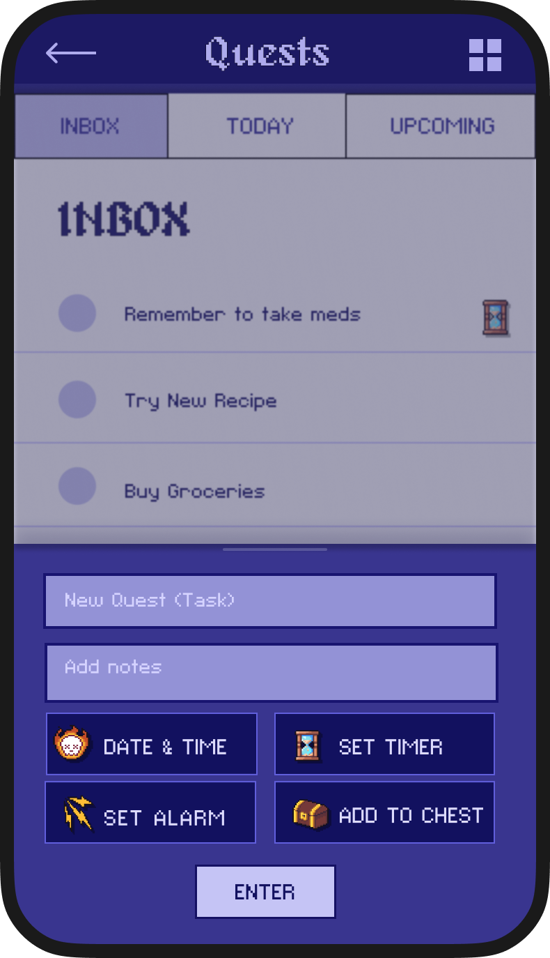
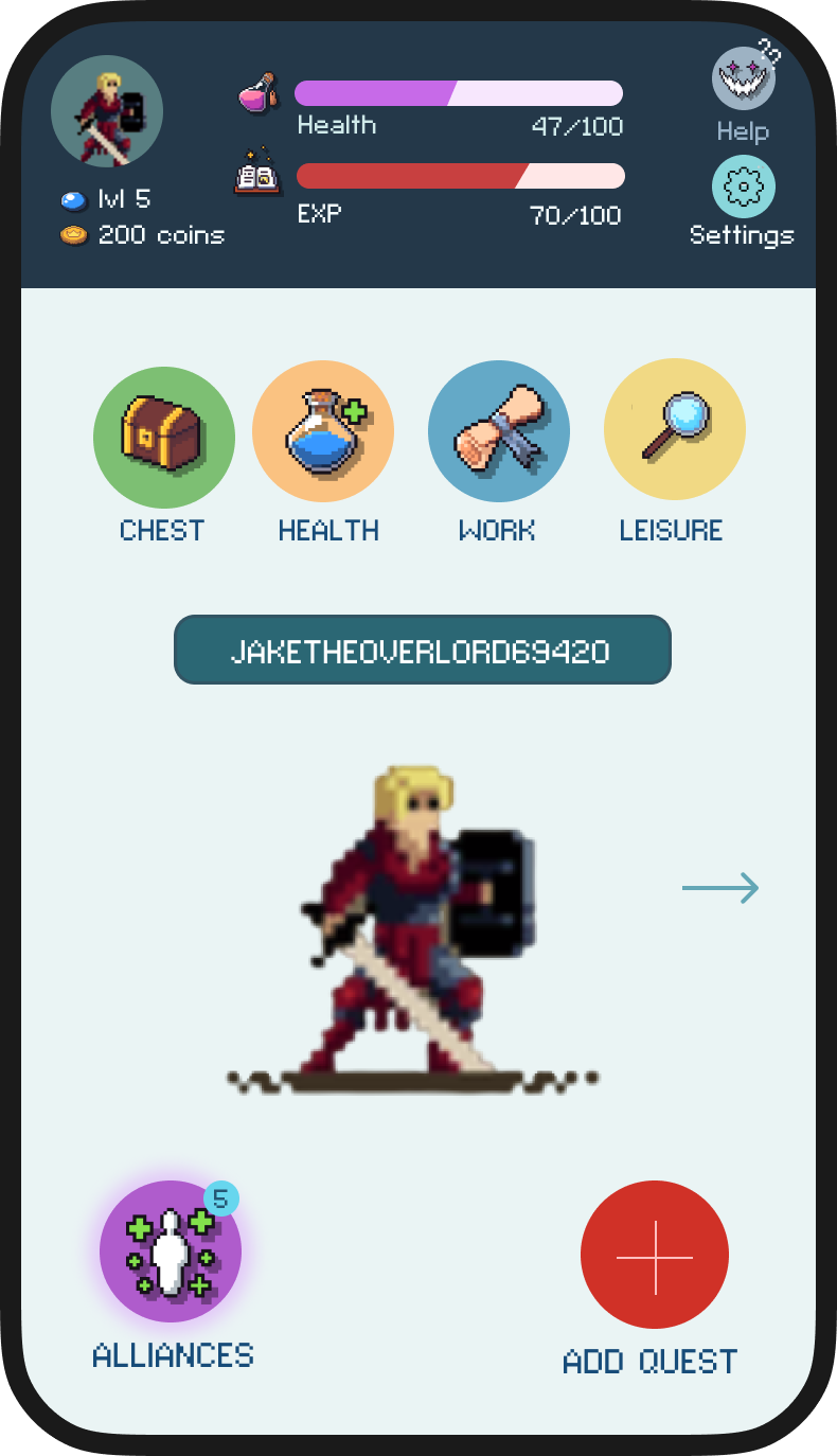
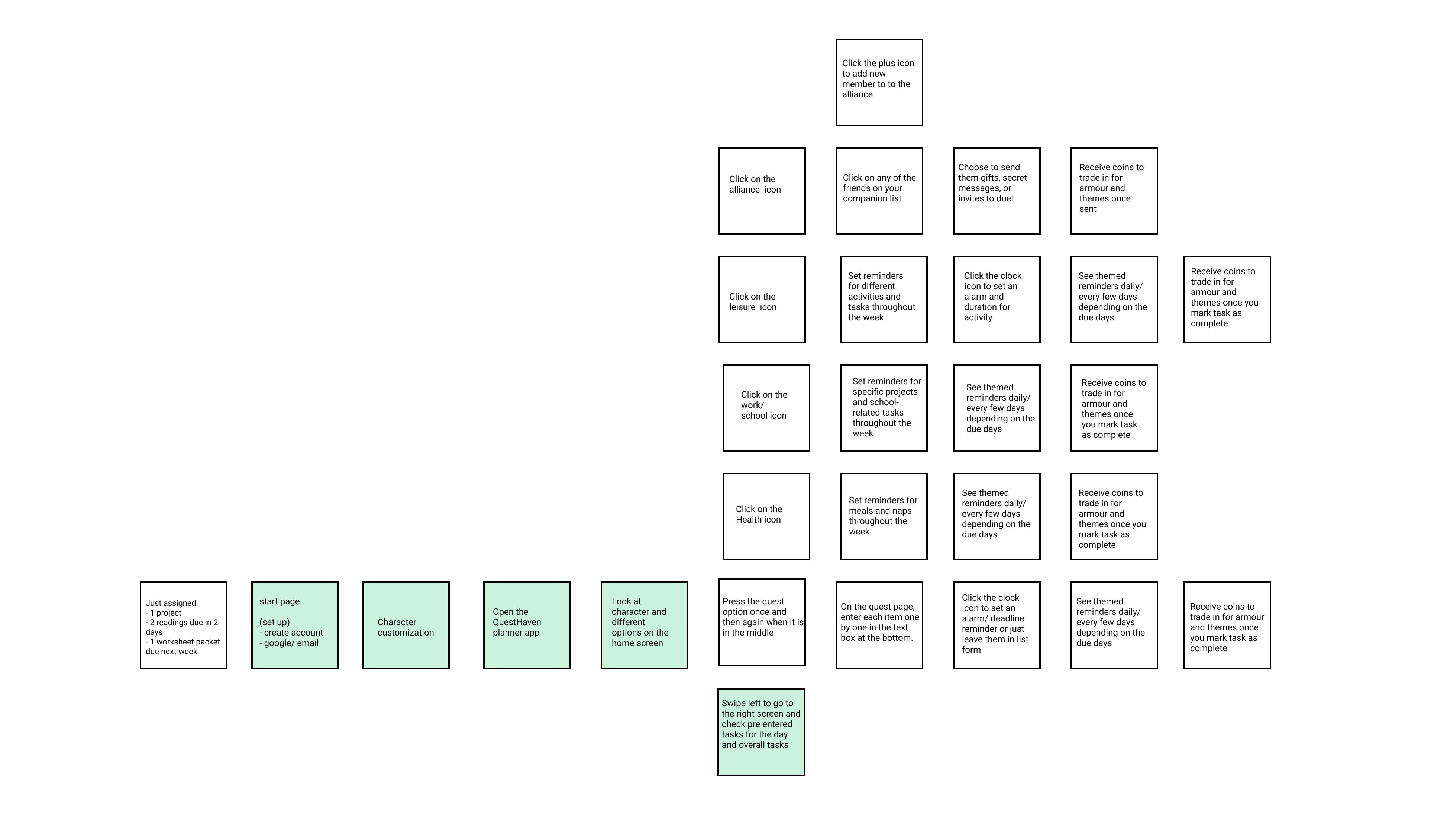
Easily add a new task and organize it according to date and time, category — even add an alarm or a timer.
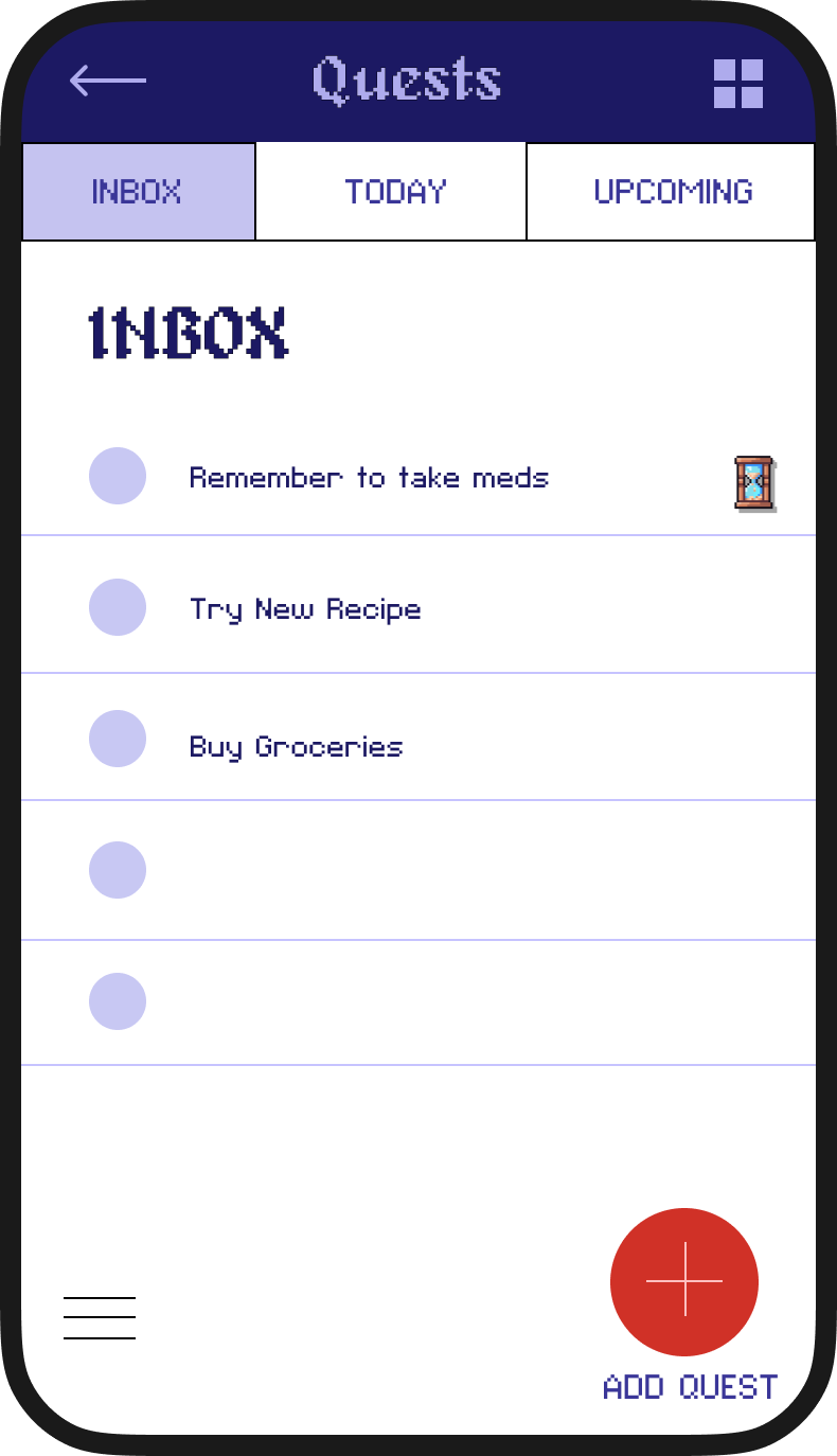
Plan for the present and future through different views of all, today, or upcoming tasks.
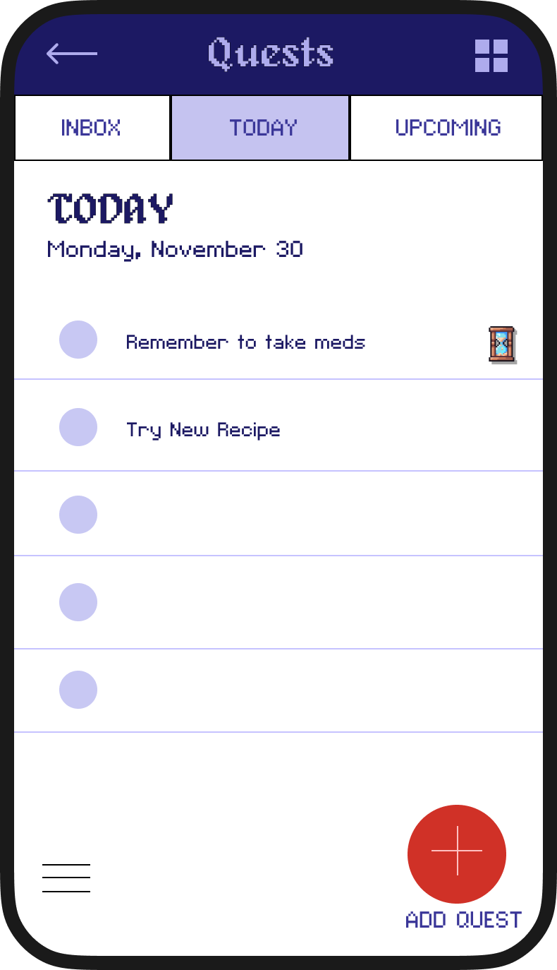
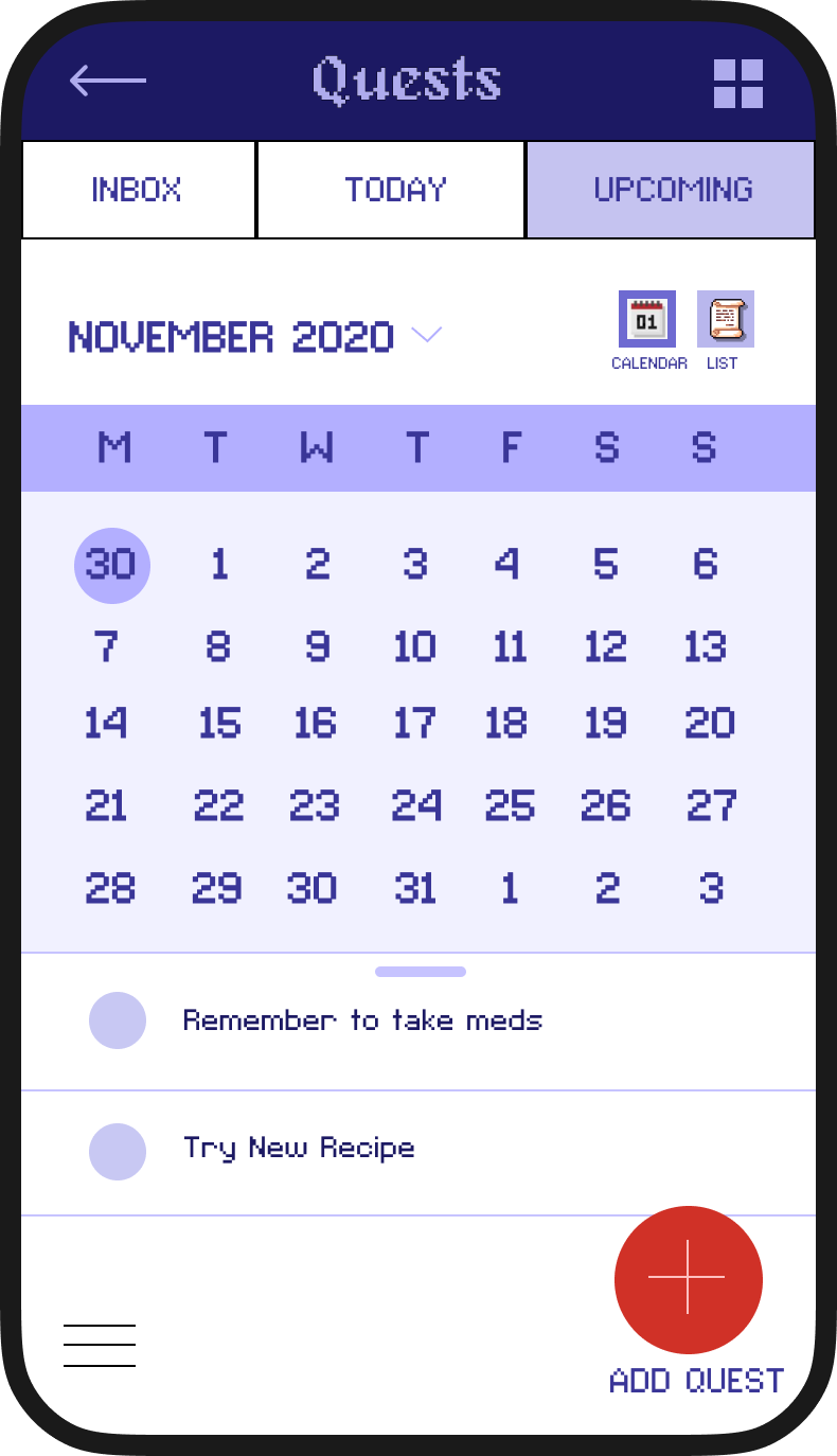
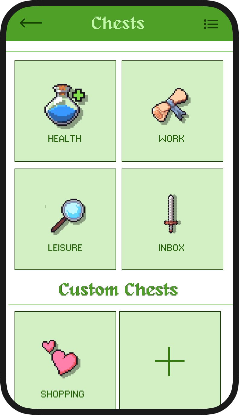
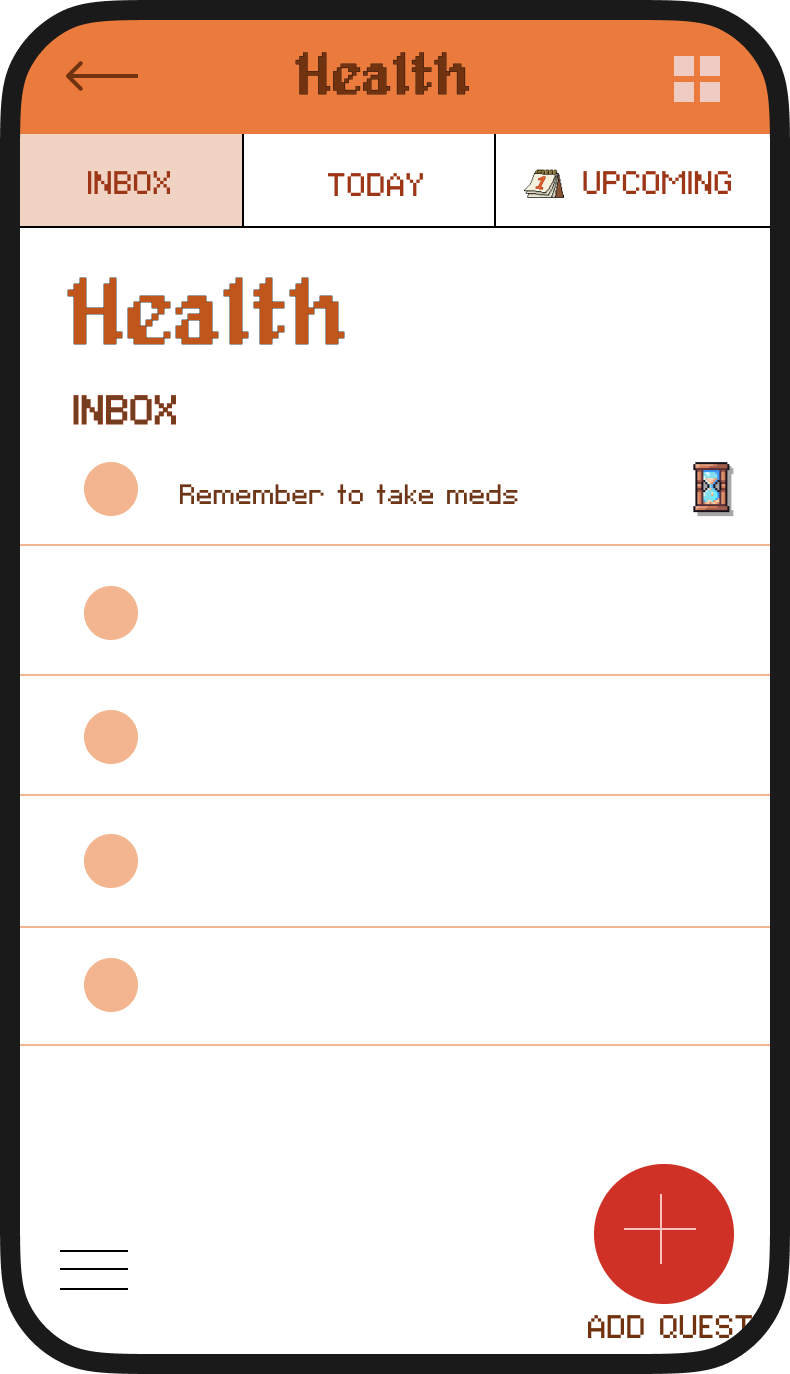
Organize tasks into different categories for flexible filtering.
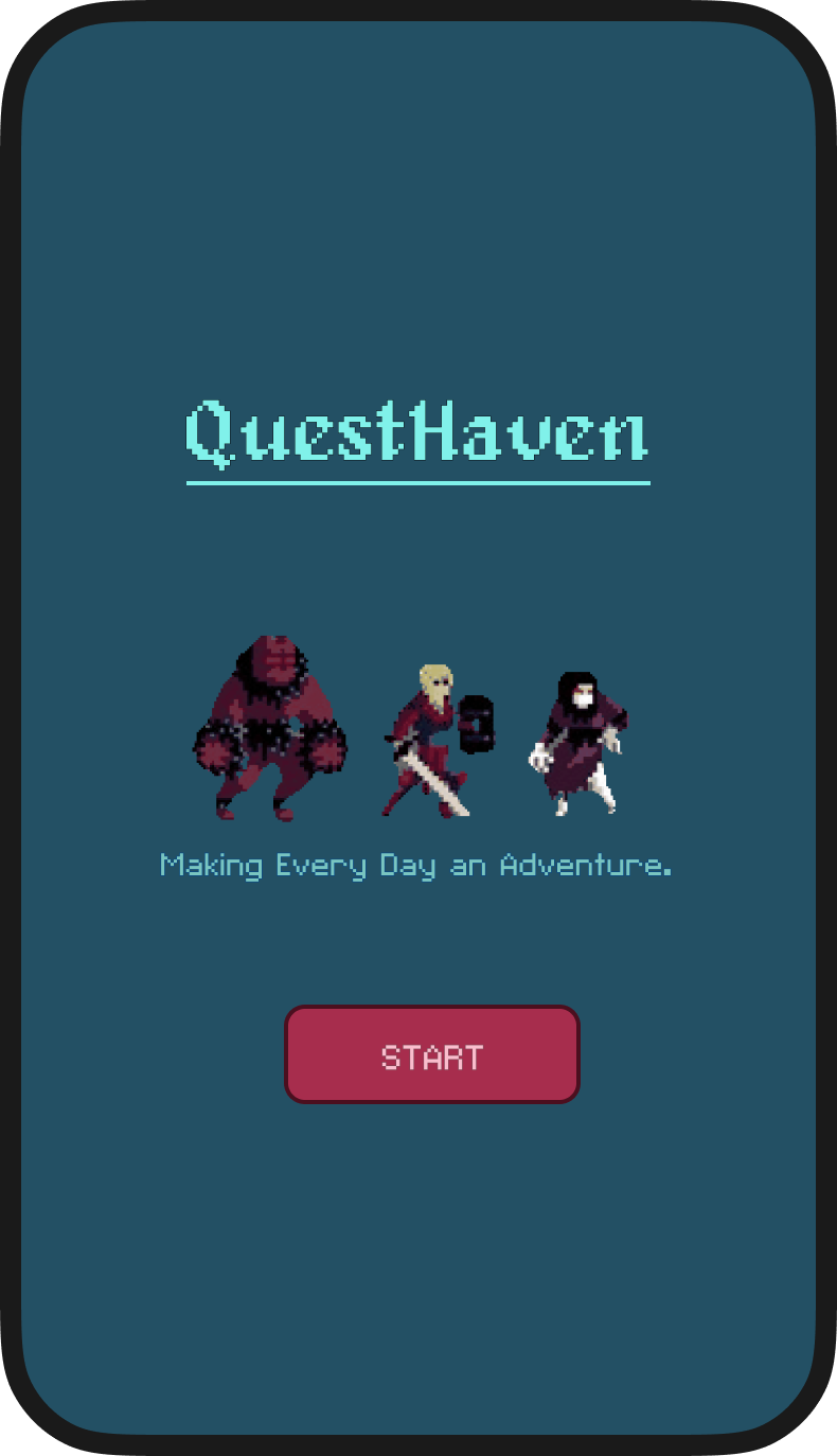
Unique role-playing and fantasy-inspired design to make settings daily tasks more fun.
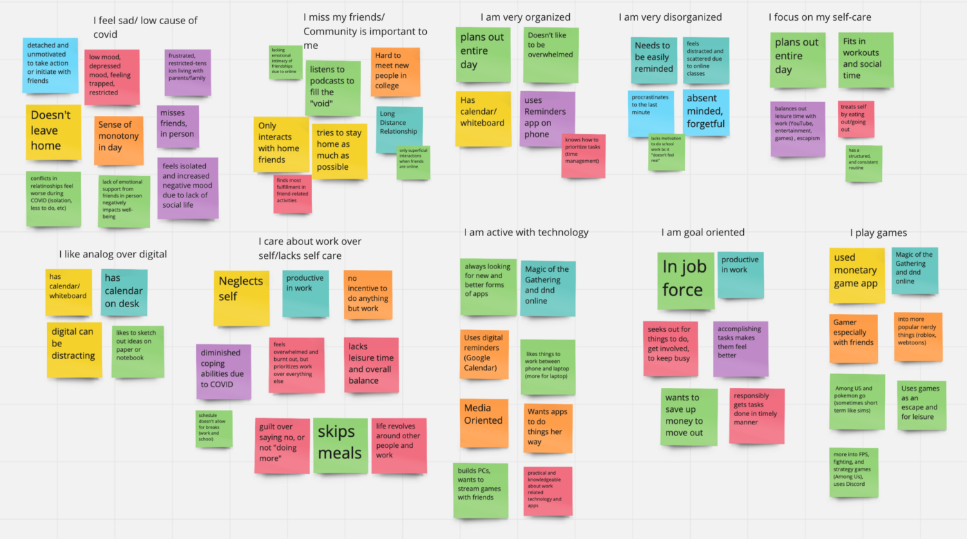
We approached writing interview questions in an open-ended manner to gain the most insight into each individual’s frustrations, goals, and desires. It was helpful to foster a natural conversation.
Using an affinity map, we organized our findings to discover patterns and trends in our interviews.
We decided to create two personas to consider the different personalities of our target audience. We identified what obstacles they might face, and how we can solve their problem by understanding their goals.
My teammate and I had varying design styles, which explains the drastic difference in design.
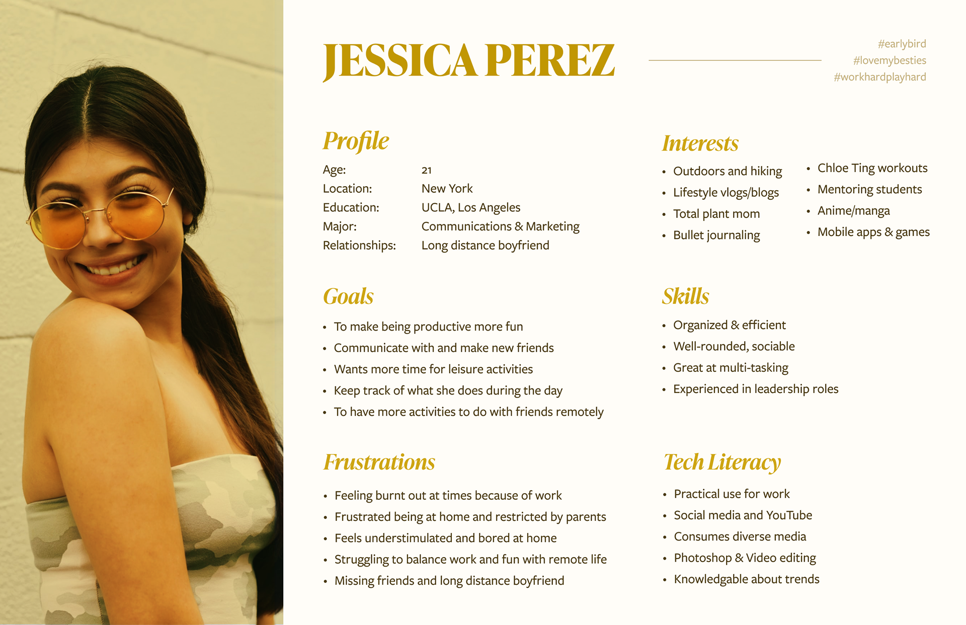
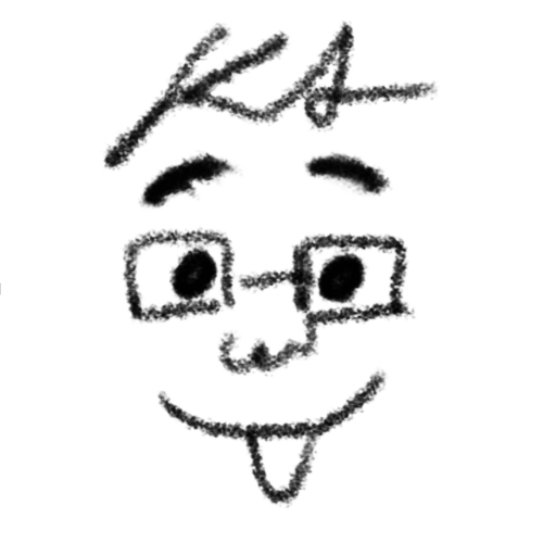
Persona 1 - I designed this one and based it on our typically organized target audience.
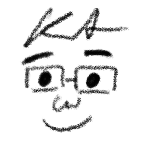
Persona 2 - My teammate designed this one and based it off our more disorganized and procrastinating target audience.
Jessica, a college senior, feels burnt out from work and lacks social interaction. How might we help her establish a work-life balance in a fun and innovative way?
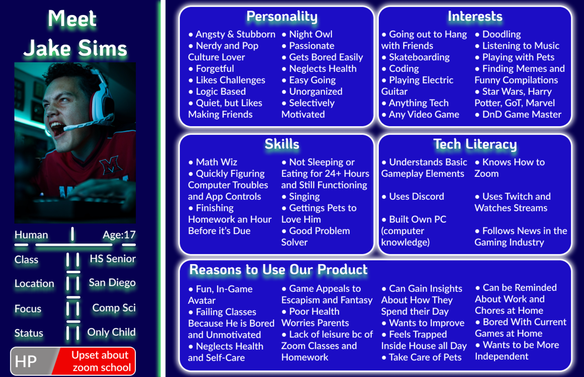
Jake, a high school senior, is failing to complete his daily tasks. How might we encourage him to organize his tasks and incentivize completing his work and chores?
I led the market research and downloaded 10 Android and iOS productivity apps. I took note of their onboarding process, features, and organization system. I noted what was done well, and what they lacked.
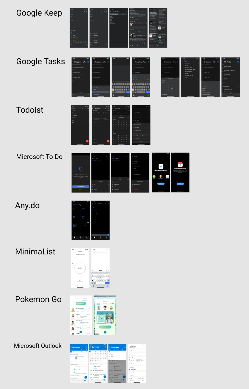
The screenshot is a list of the apps I tried and does not include Apple's Reminder app, and Finch - the Self Care App.
My teammate and I decided on what features to work on based on their pros and cons. We focused on customization, an easy logging process, and a flexible organization system with "Chests" or additional lists.
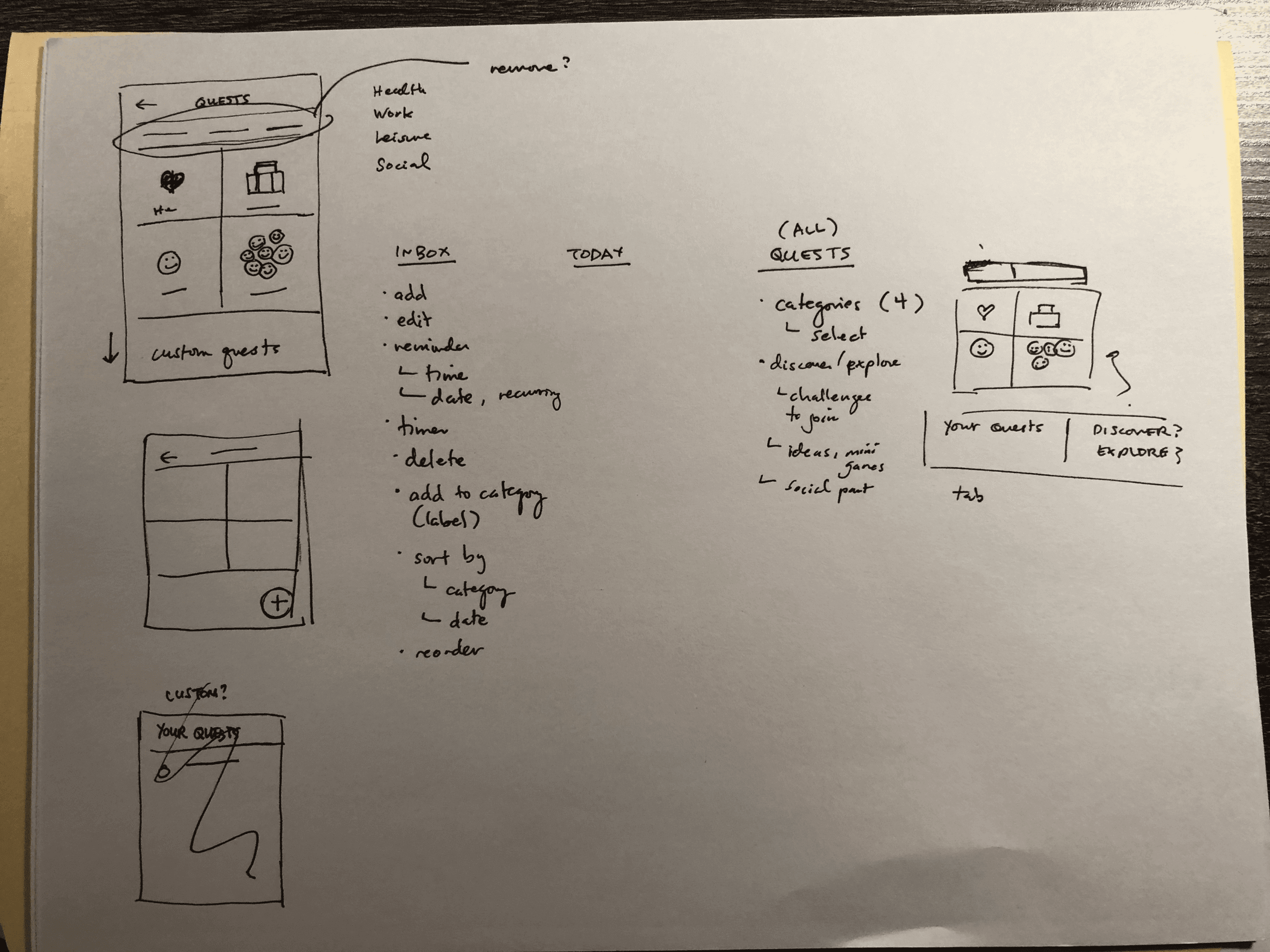
Next, I drew some rough sketches of some screens—primarily the onboarding and task logging process. After, I created some low-fi wireframes on Figma to design the main screens where tasks will go.
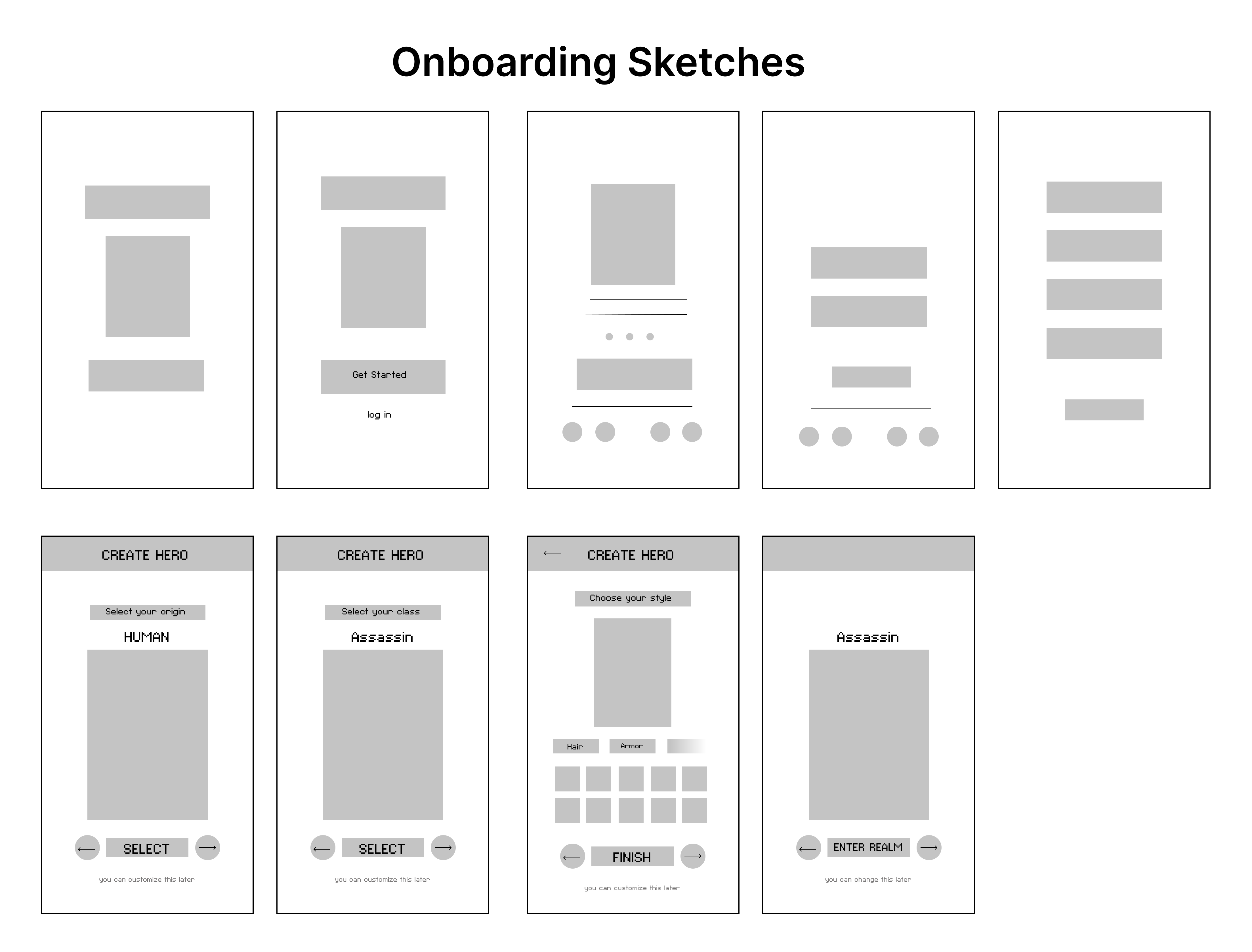
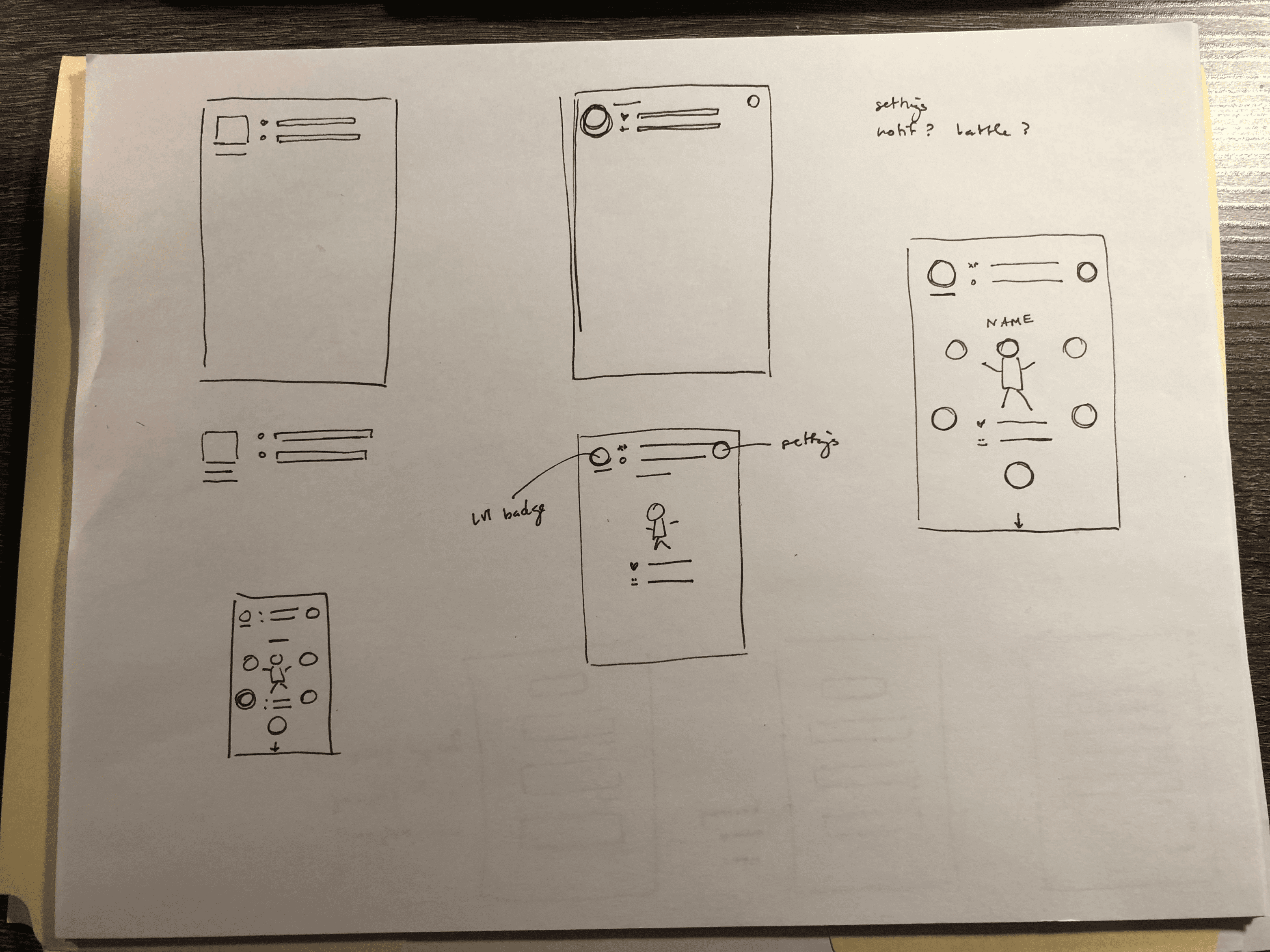
In our first prototype, I started to establish a visual identity that was retro and fun with the pixel art typeface and avatars. We ran into some problems with the user flow and adding features without cluttering the interface.
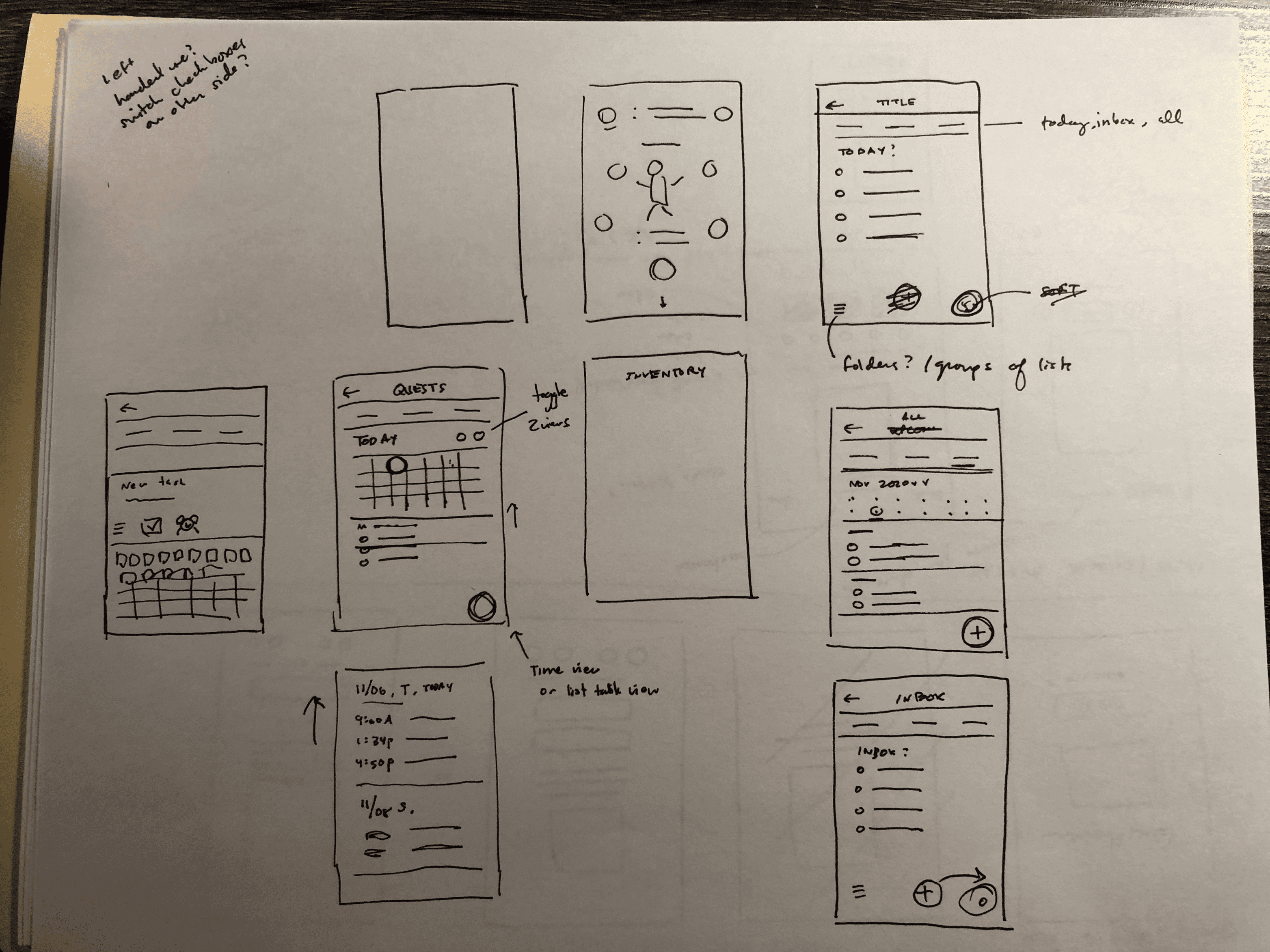
With three user tests, users reported that the circular button layout was confusing and cluttered.
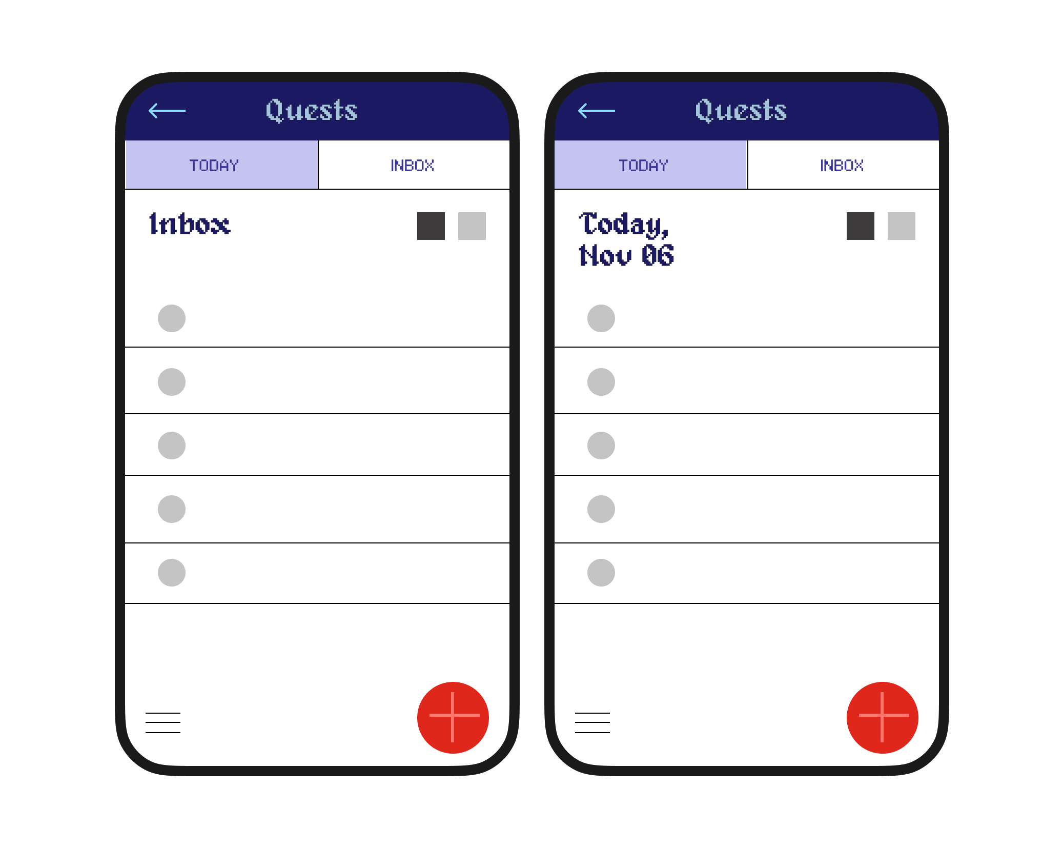
I also found that the more intuitive order between "Today" and "Inbox" tasks should be flipped with "Inbox" first—since tasks that are captured automatically go into the Inbox.
We struggled with the information architecture for the organization system of the tasks. It was difficult to add features without complicating the user flow.
After testing our Prototype #1, we learned there were many improvements to be made. You can try our prototype #2 at Final Design.
.png)
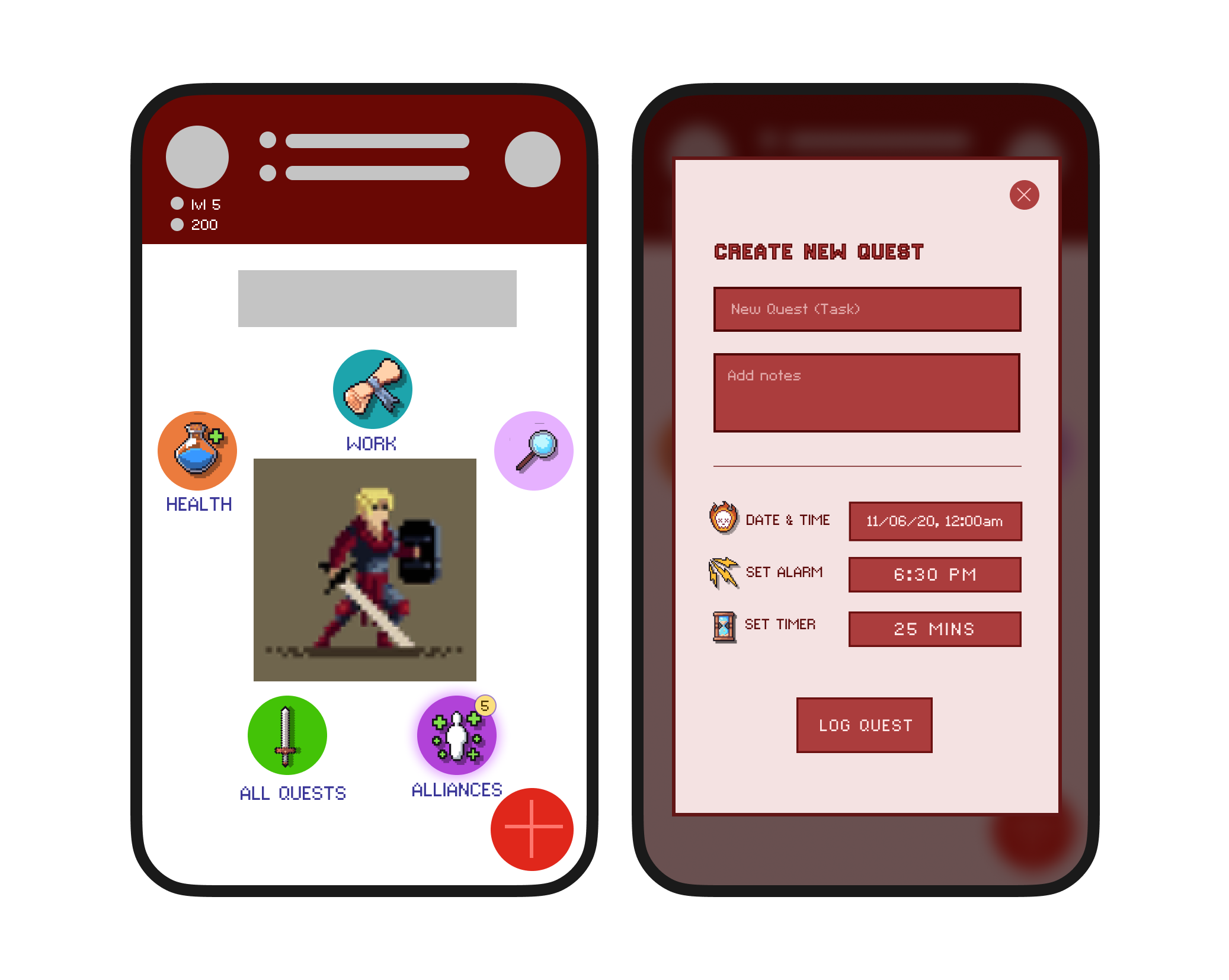
I changed the circular layout button into something more aligned and less cluttered. I also added text underneath each button to help the users understand what they mean and to help with accessibility. There are three ways to add tasks for efficiency.
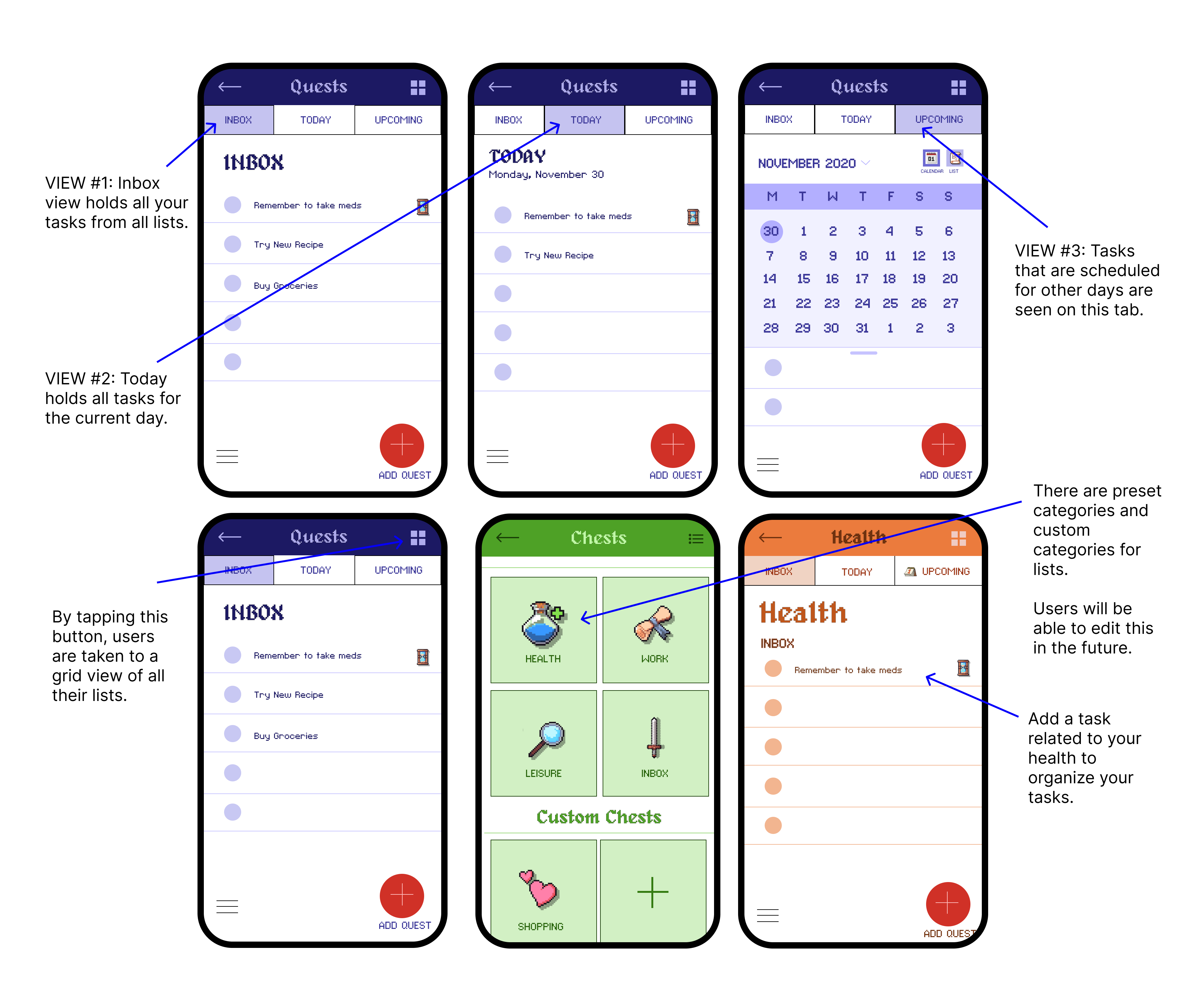
I also developed the design for the task logging system with new tabs and an upcoming view — and the organization of how users access their other lists.
After this user test with the participants, I gathered my notes and organized them based on their thoughts on the onboarding process and task-logging process.
The time constraint of two weeks was challenging to get user interviews and do a thorough usability test while applying our findings in a full hi-fidelity prototype.
Organizing the information architecture was more difficult than expected. I realized that maybe I should have focused more on the user flow and built the screens from user tasks rather than the other way around.
All users found the design unique and fun. I think the brand identity could be more consistent, but the overall direction I led us in seemed to work in making users more motivated to use Questhaven.
Our onboarding process as well as the user task of adding a quest to their list was intuitive and clear. We focused a lot on the flow of the onboarding process and it paid off. Our user test gave a lot of insights and new ideas to improve upon our prototype.
In the future, I would like to focus more on the user tasks and user flow to make the process more streamlined and straightforward.
It would be great to have an initial tutorial as the user onboards.
Focusing on the core features of adding/completing tasks, reminders, and different lists would help in making the Questhaven more intuitive and less confusing.
While we ended the class with this hi-fidelity prototype embedded below, we definitely left with more ideas to make the next prototype even better.
Feel free to try out the onboarding process, entering a task or quest, and viewing the different views for your tasks.