Using engaging storytelling and an unconventional yet approachable user interface, Otherworld Gateway brings players into adventures that get them exploring new and unfamiliar places.
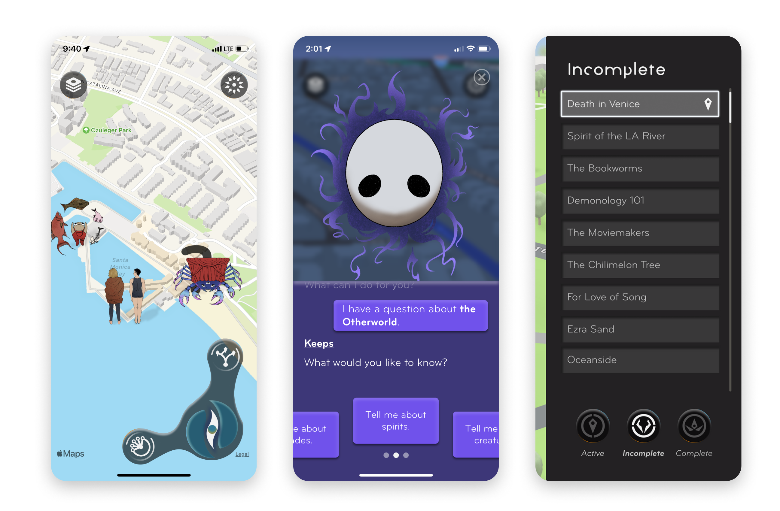
Screenshots from Otherworld Gateway's beta game in the iOS mobile app tester, TestFlight.
Wolf Suit Games had a minimal prototype with a storyline to test out. These are screenshots of their user interface before we did any designs.
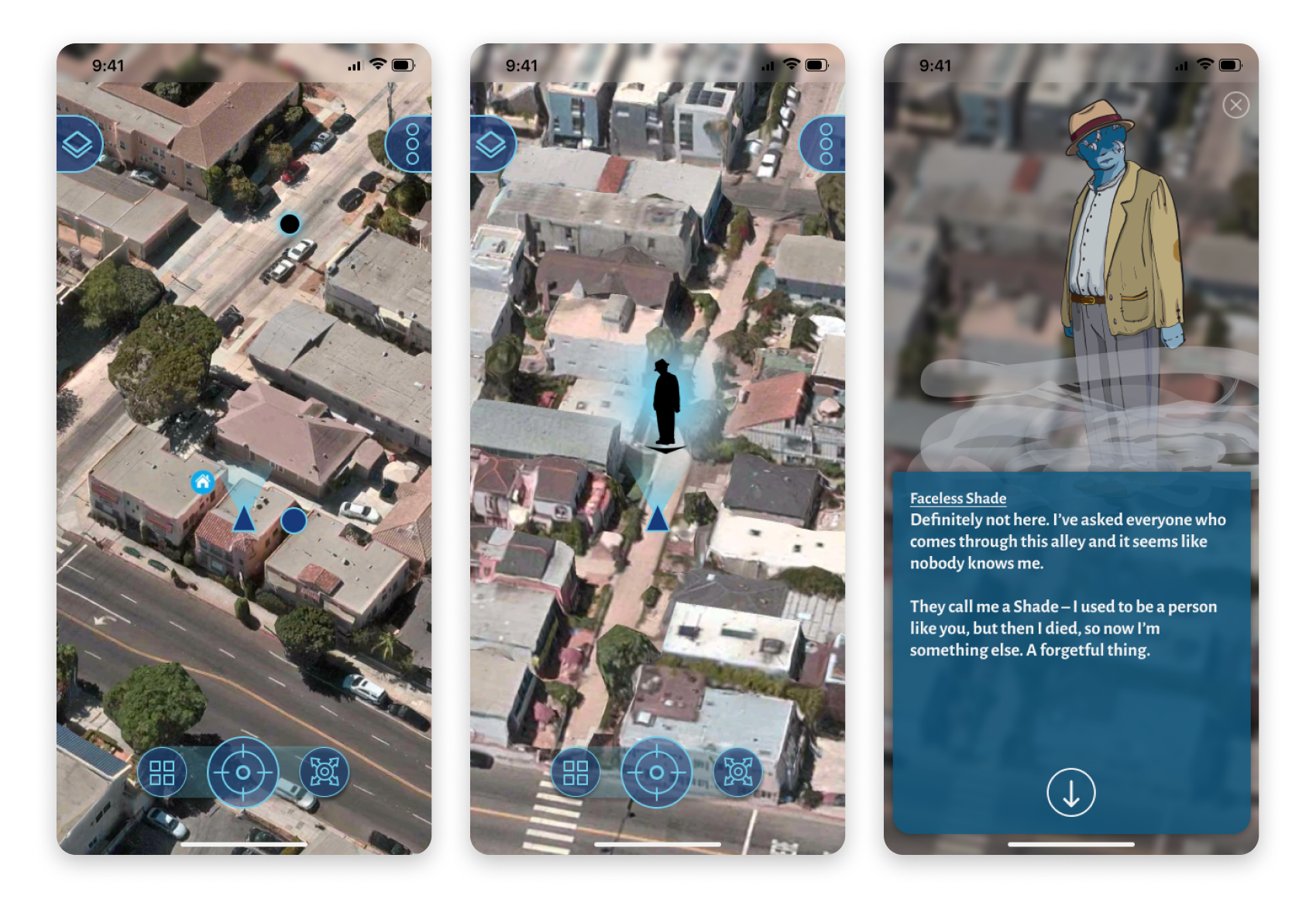
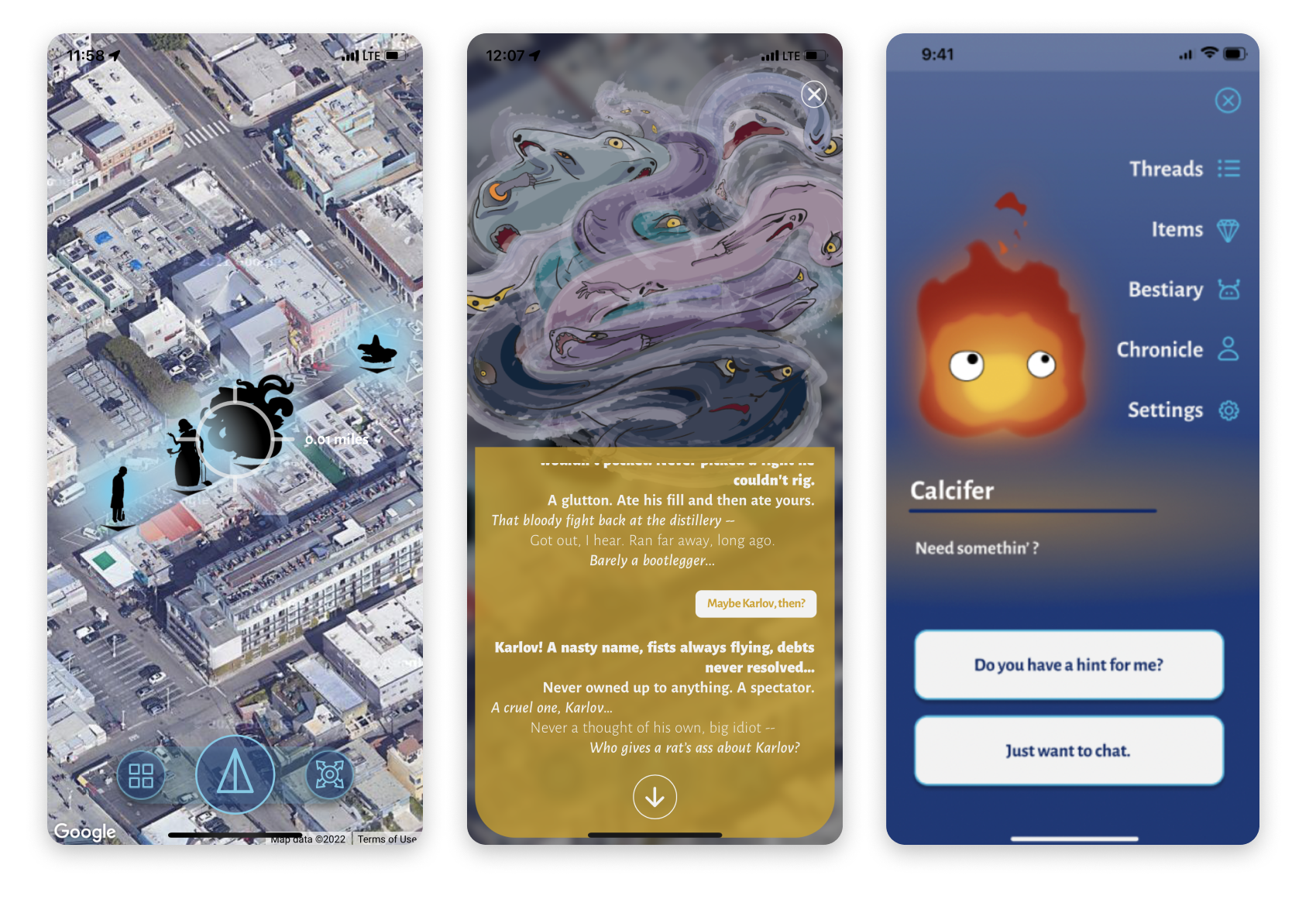
Using TestFlight, my team and I went to Venice Beach to try out the storyline and interacted with the beta app interface. We went out to solve a murder mystery by traveling to different areas around Venice Beach. By trying it out, I was able to pinpoint some problem areas and analyze what needed improvement.
.png)
Icons are unclear, point of interest indicator is inconsistent, and text box is crowded.
.png)
The app failed to trigger gameplay and detect players in the right location, leaving players frustrated.
Some of the client's requirements for Otherworld Gateway were:
- Simple and intuitive - Currently, the map navigation is frustrating with unfamiliar button placement and the text box is too cramped.
- Immersive - In an attempt to be immersive, the icons were unclear, the map failed to detect the player and trigger dialogue, ultimately sacrificing smooth gameplay.
- Unique/Unconventional - While the UI elements are quite unique, they lose out on letting the players know what they mean and match more of a sci-fi vibe vs. fantasy/"whimsical" nature. They sacrifice the foundations of a good UX experience for a unique one.
Competitive Analysis
In order to design a game that is intuitive, immersive and unique — it is important to analyze the strengths and weaknesses of competitors on the market. By doing this, we can leverage what was done well, and refine what features are lacking.
I took a look at other location-based mobile games and compared them to see what features were done well.
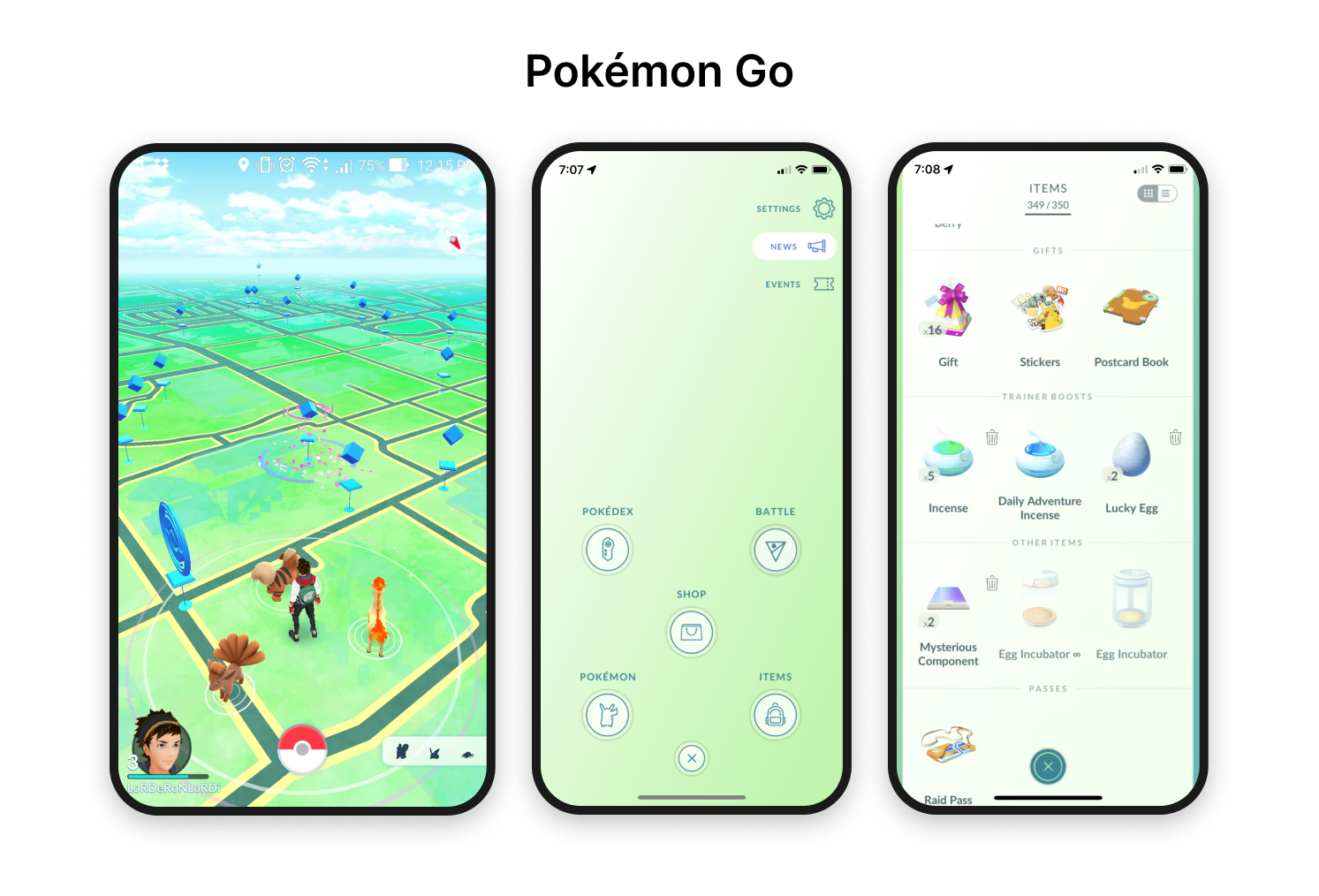
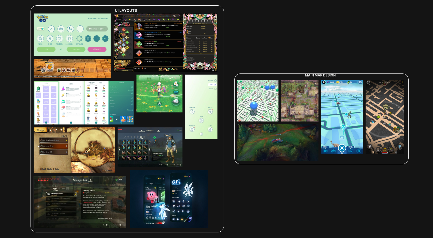
Pokémon Go
1. Cohesive design system and UI - good color palette, transitions, round, modern design that matches theme and mood with 3D design.
2. Icons are clear and straightforward with accompanying text.
3. Map is intuitive, but uses "one tap" to activate all elements in the game, which leads to difficulties in selecting the right object.
4. Great organization of Pokémon and giving previews + their full stats.
5. Gives players incentive to play with the use of randomness and progression.
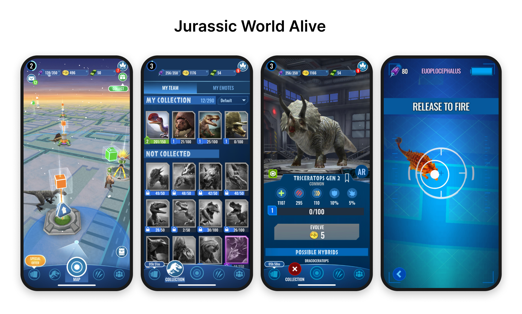
Jurassic World Alive
1. A more traditional button layout with icons and text creates a familiar and easy-to-use interface.
2. Creates incentives for players - battle dinosaurs, target shooting to capture DNA, Challenge mode, Player vs. Player mode.
3. Familiar game mechanics, similar to Pokémon Go make it intuitive to play.
4. Cohesive Sci-Fi theme, 3D design and captures dinosaurs like from the franchise.
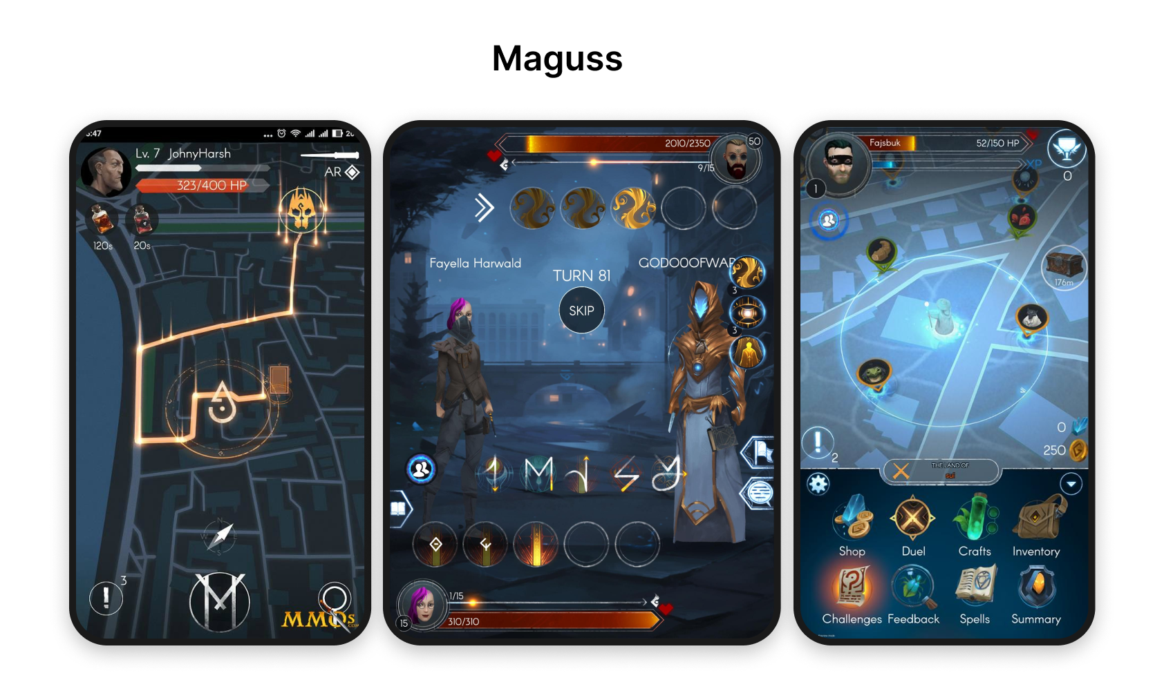
Maguss
1. Wizard theme location-based MMORPG game where you battle others, collect ingredients to make spells, and brew potions — lots of incentives to play as well.
2. Dark mode gameplay and 2d graphics give it a distinct magical feel.
3. Game mechanics are familiar with the icons and text as well as health and currencies.
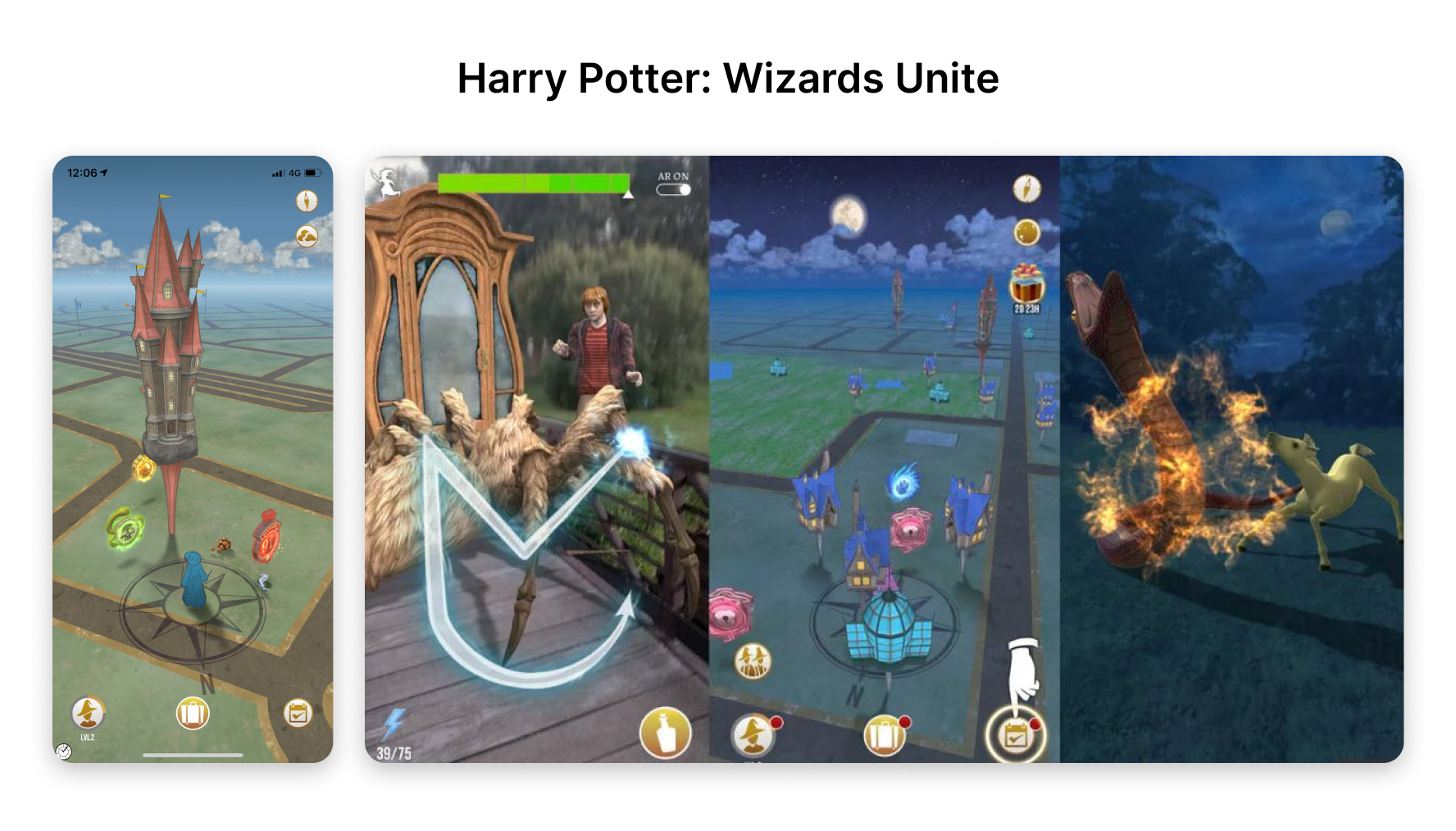
Harry Potter: Wizards Unite
1. Familiar game mechanics, but with a uniquely sketched colorful, storybook aesthetic.
2. Gameplay gestures are more varied with tracing spells vs. tapping, or just throwing the pokéball again and again.
3. Struggles to introduce players to its features and what to prioritize leaving them unsure of what to do.
The process for our team's workflow was pretty straightforward. We agreed on deliverables to send to the client on certain dates. It went like this: Mood boards → Low-fi wireframes → Mid-fi wireframes and iterations → Hi-fidelity and final designs.
Throughout our process, we also created a user flow, and a design system to keep each team member on track with making consistent designs.
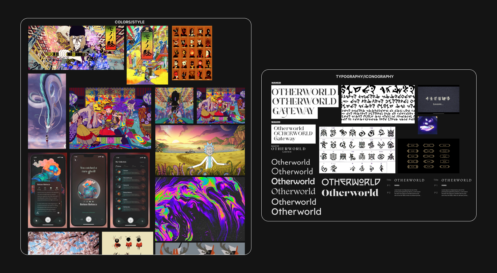
Mood boards
Our mood boards varied greatly in style and references. It helped to explore different ideas since the client's initial request was fairly broad. He wanted something unconventional, whimsical, and colorful — something that breaks boundaries and has never been seen before.
He mentioned some references to Studio Ghibli, and Mononoke, the avant-garde Japanese animated series. We explored UI layouts, main map designs, look-and-feel, and typography/iconography.
Mobile Sitemap
We actually started off with low-fi wireframes before making the site map. The client initially assigned us screens to design already before we made the user flow to better connect how all the screens might interact with each other in the game.
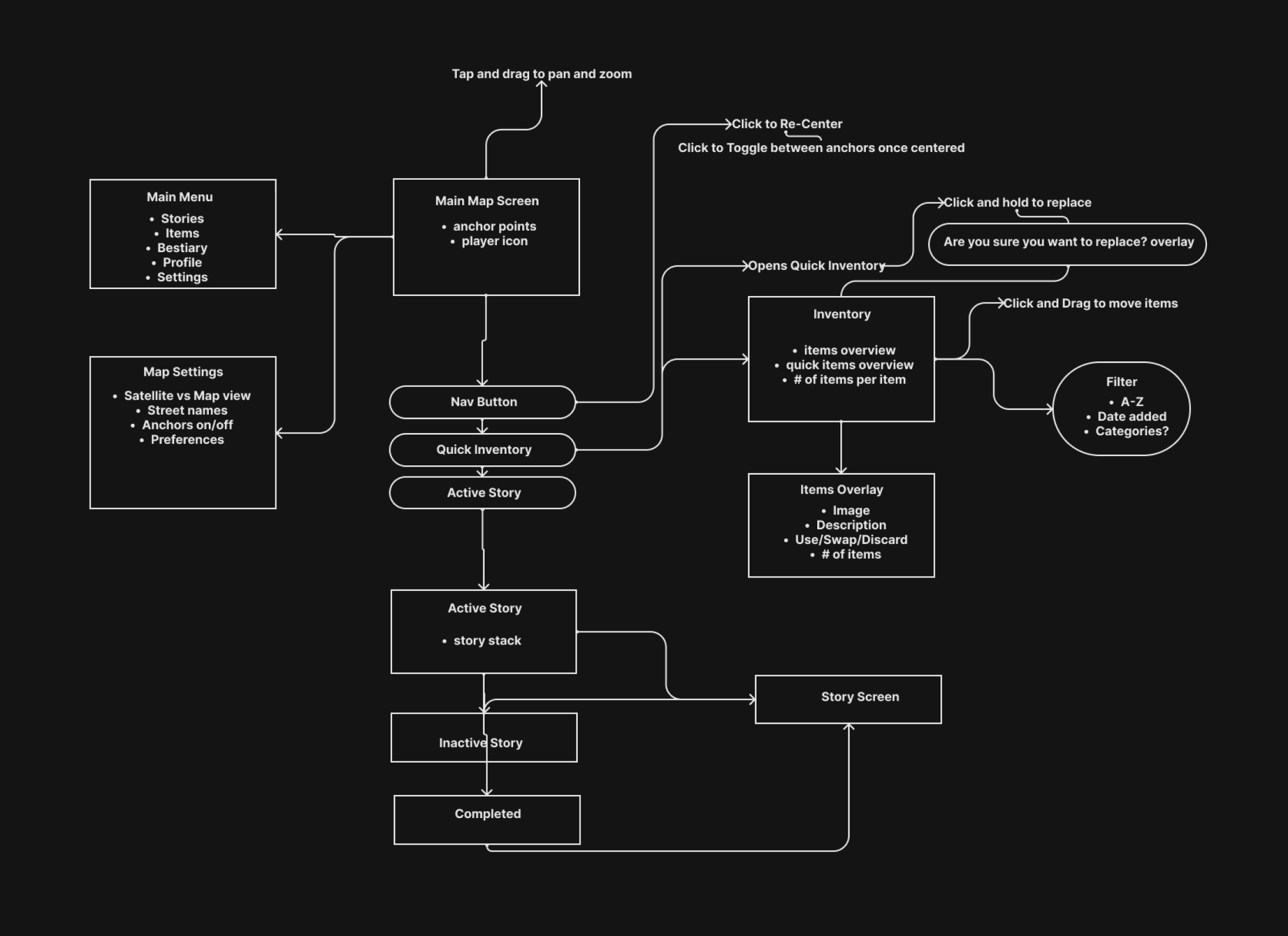
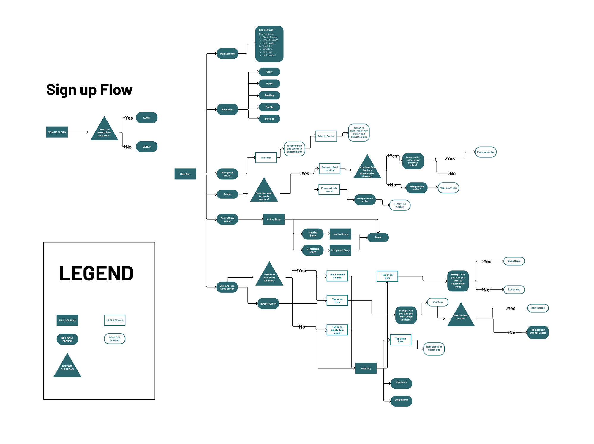
User flow
We also created a detailed user flow map to reference the interactions throughout Otherworld Gateway's screens, buttons, and overall UI. This was incredibly helpful as a hand-off document for the developers so they understood the implications of each action a player might take as they go through the game screen by screen.
Low-fi Wireframes
The low-fi wireframes we made were a layout of the UI of each screen. I was assigned the main map layout as well as the settings menu for accessibility features. Every week, we'd have critiques and feedback sessions with the founder and our team, so we all pitched in on each other's designs.
.png)
Initially, the feedback I got from the client was that my designs were too traditional and he wanted something more unconventional.
.png)
After the following week, I worked with another team member, and we came up with other versions for the main map screen.
Here's the main map attached to the inventory system that my other teammate designed.
Mid-Fi Designs
As we moved on to mid-fi designs, I was hopping around with different screens and tasks rather than focusing on one thing — as I took on whatever someone needed help with.
I tried out different color schemes on the inventory screens as my other teammate designed the iconography. It was at this point it would've been useful to create a design system, but our client still wasn't settled on what kind of design he wanted.
.png)
We experimented with more ornate icons for the buttons as the client requested — but his complaint this time was it was too "flat" and "two-dimensional." He wanted something more.
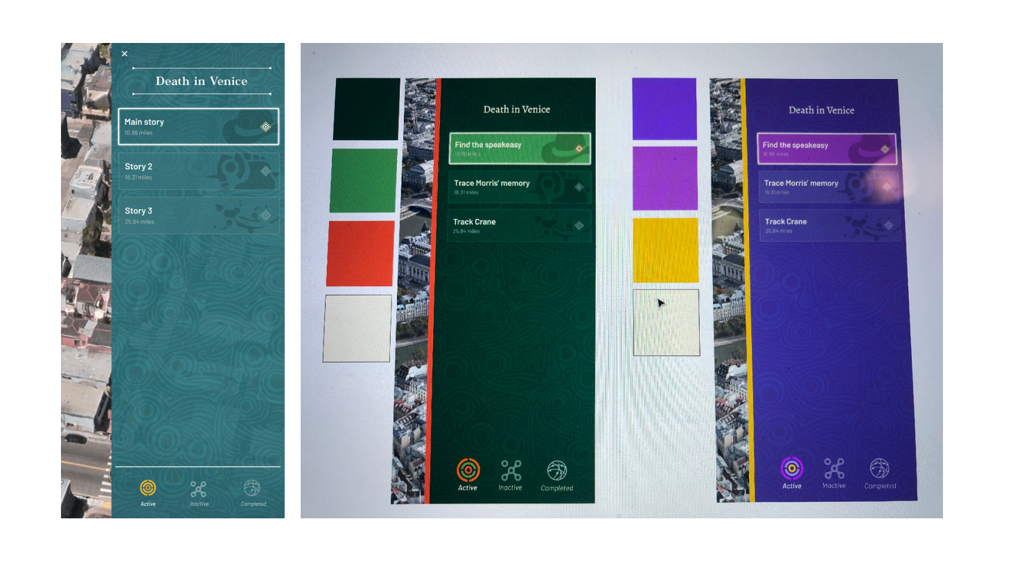
I also tested out different color palettes for the
Active Story menu and helped in creating the layout for the screens. I
added text underneath the icons for accessibility, and applied my learnings from my other project,
Questhaven — where I learned that you
can't expect users to know what icons mean especially in a themed app..png)
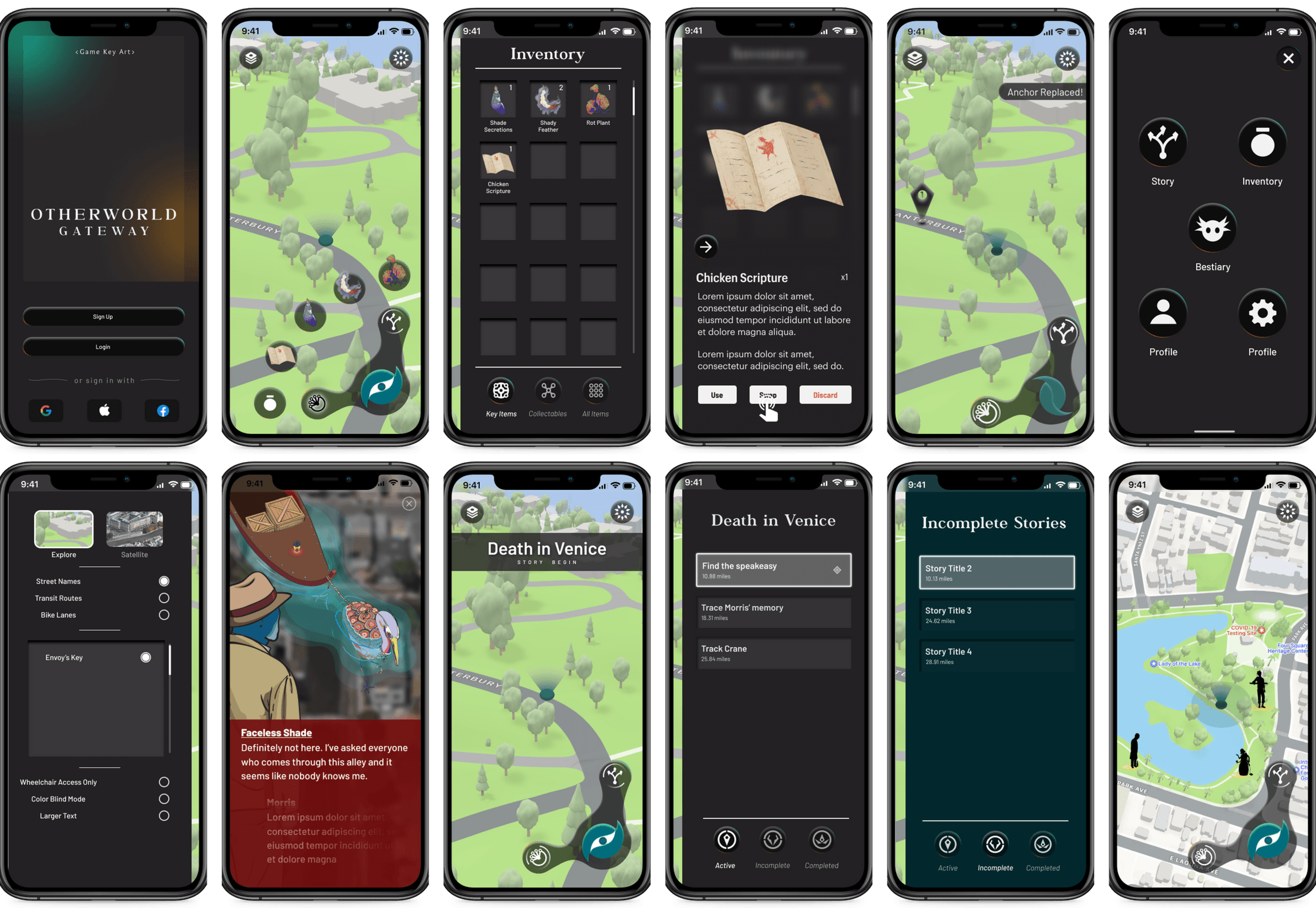
These are some of the main map screens with the new icons our teammate designed, and I added the player's triangular icon noting where they are and how they are oriented on the screen. I had variations of the player icon — but this was the one our client chose for us to move forward with.
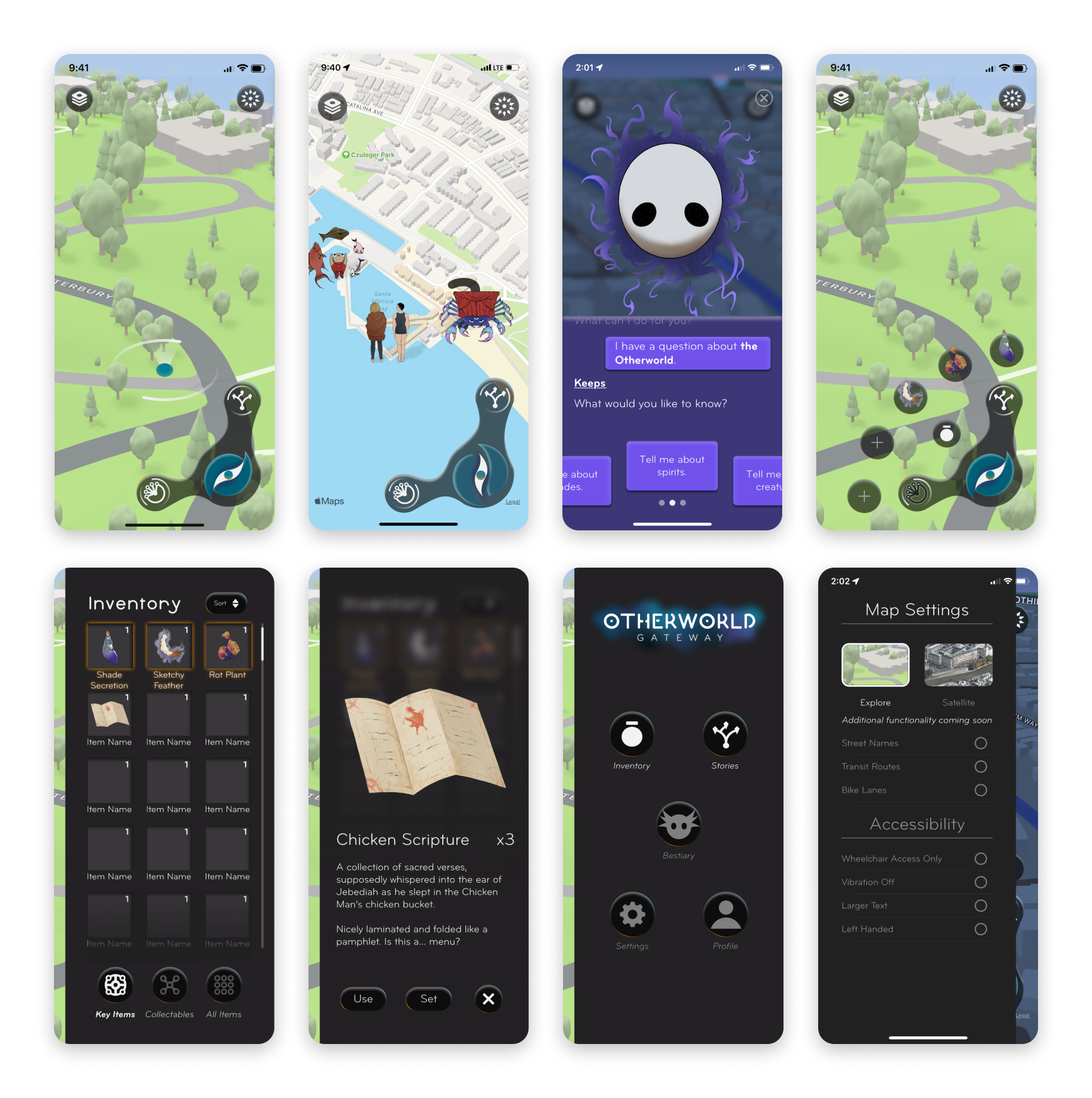
Hi-Fidelity & Final Designs
After mid-fi designs, we moved onto hi-fidelity and finished up final designs for hand-off to the developers. This was when we created the design system to have more cohesion throughout our designs.
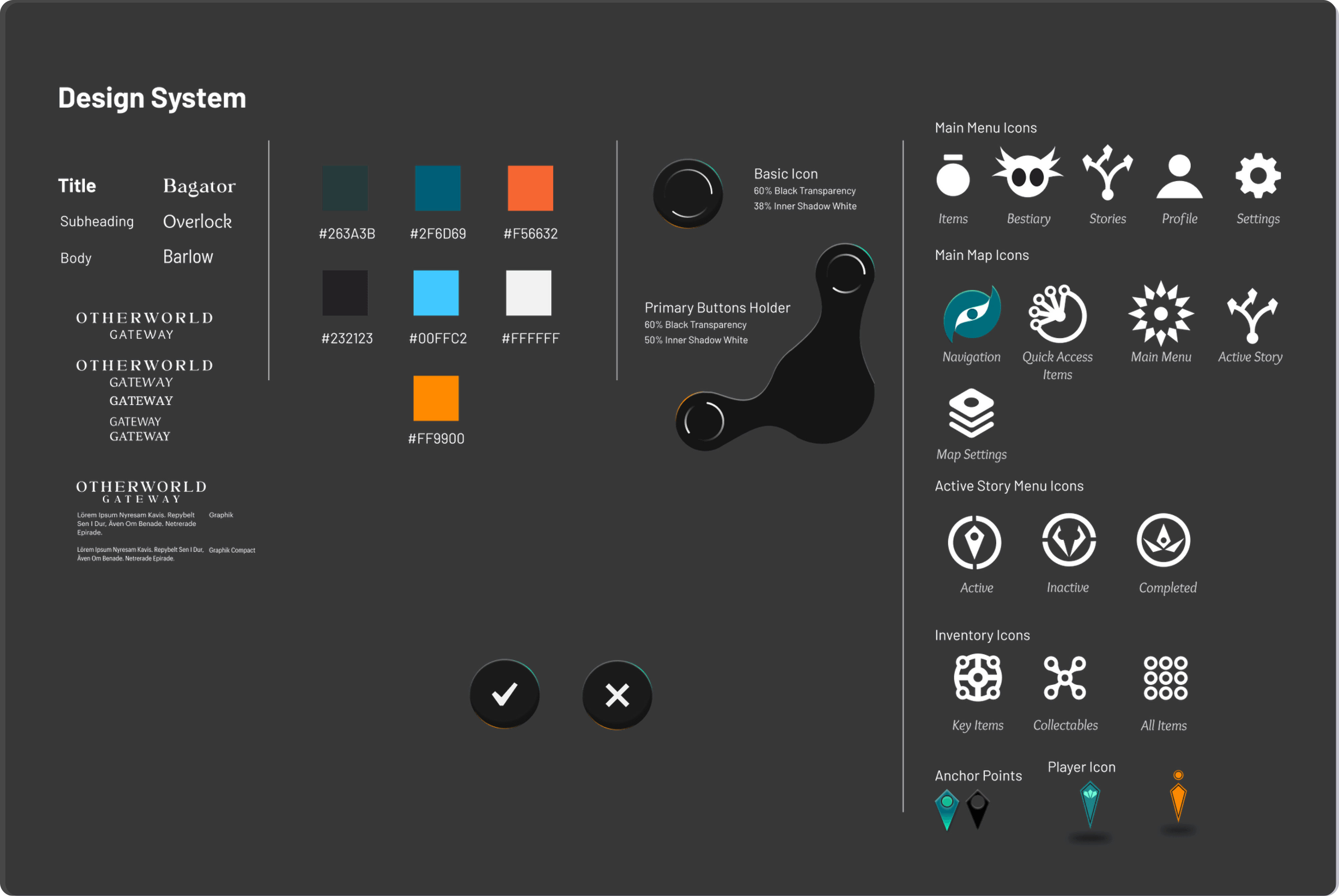
I looked for the typefaces and the client approved them so we moved forward. I also created the confirm and exit buttons (check and x buttons).
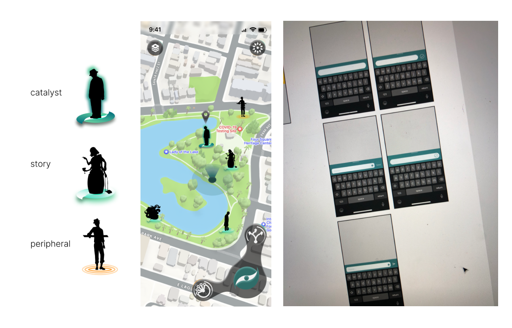
I created the designs for the silhouette characters that the players are supposed to go to and encounter. I used the main icon for the navigation screen as the anchor for the main character or "catalyst," an unfilled version of the icon for the characters that are part of the story, and the orange ripple design for characters that are extra.
Additionally, I also designed the message input for when players are able to type their own responses in-game. I did a competitive analysis based on the best messaging apps and we went with one similar to Apple's iMessage for the sake of familiarity and ease of use.
.png)
Here is the hi-fidelity designs of the main map screen with the inventory user flow. Finally, the client approved this dark-mode-inspired, claymorphic/neumorphic style design with more depth and texture.
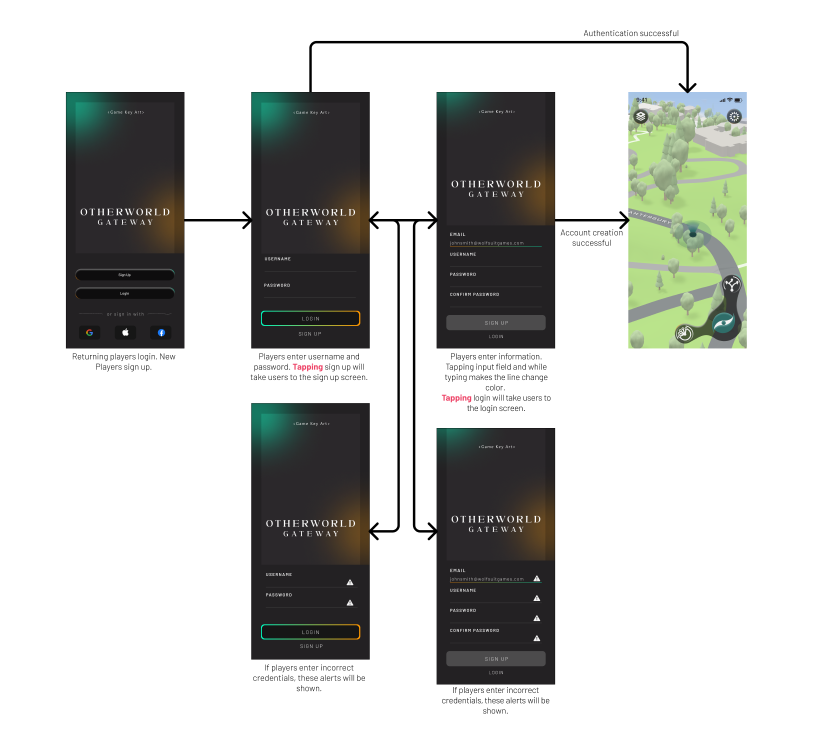
I also helped out in designing and creating the log-in and onboarding user flow and screens.
Client satisfaction
While this was definitely a challenging project, we left Wolf Suit Games in great shape for developing the beta version of Otherworld Gateway and its future. Our client was very satisfied and happy with all our work. We completed designs for a total of 40+ screens, a full design system, 30+ icons, and collaborated directly with the founder through more than 15 meetings.
The outcome
After four months of work, we finally sent all the deliverables to Wolf Suit Games, and they released their beta this Winter 2022. It is now available to try out via TestFlight on iOS.
KEY FEATURES
Feature #1: Immersive Stories & Mysteries
Otherworld's mysterious stories provide an incentive for players to go on adventures and explore new and unfamiliar locations. These storylines are set in different places where the plot is revealed as players explore.
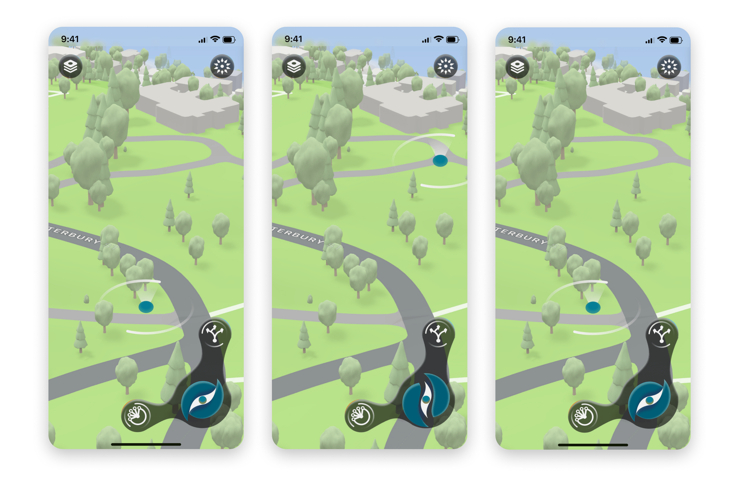
Feature #2: Explore and Recenter Navigation
As players venture, they can move around the map by pinching and zooming in and out which opens up the main blue icon, and then when they press the icon again, it will close up and recenter the map back to their location.
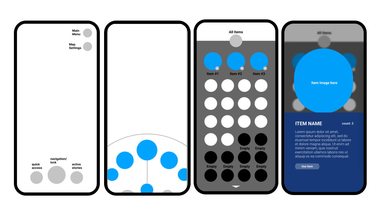
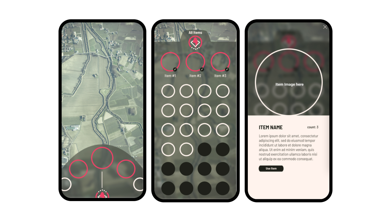
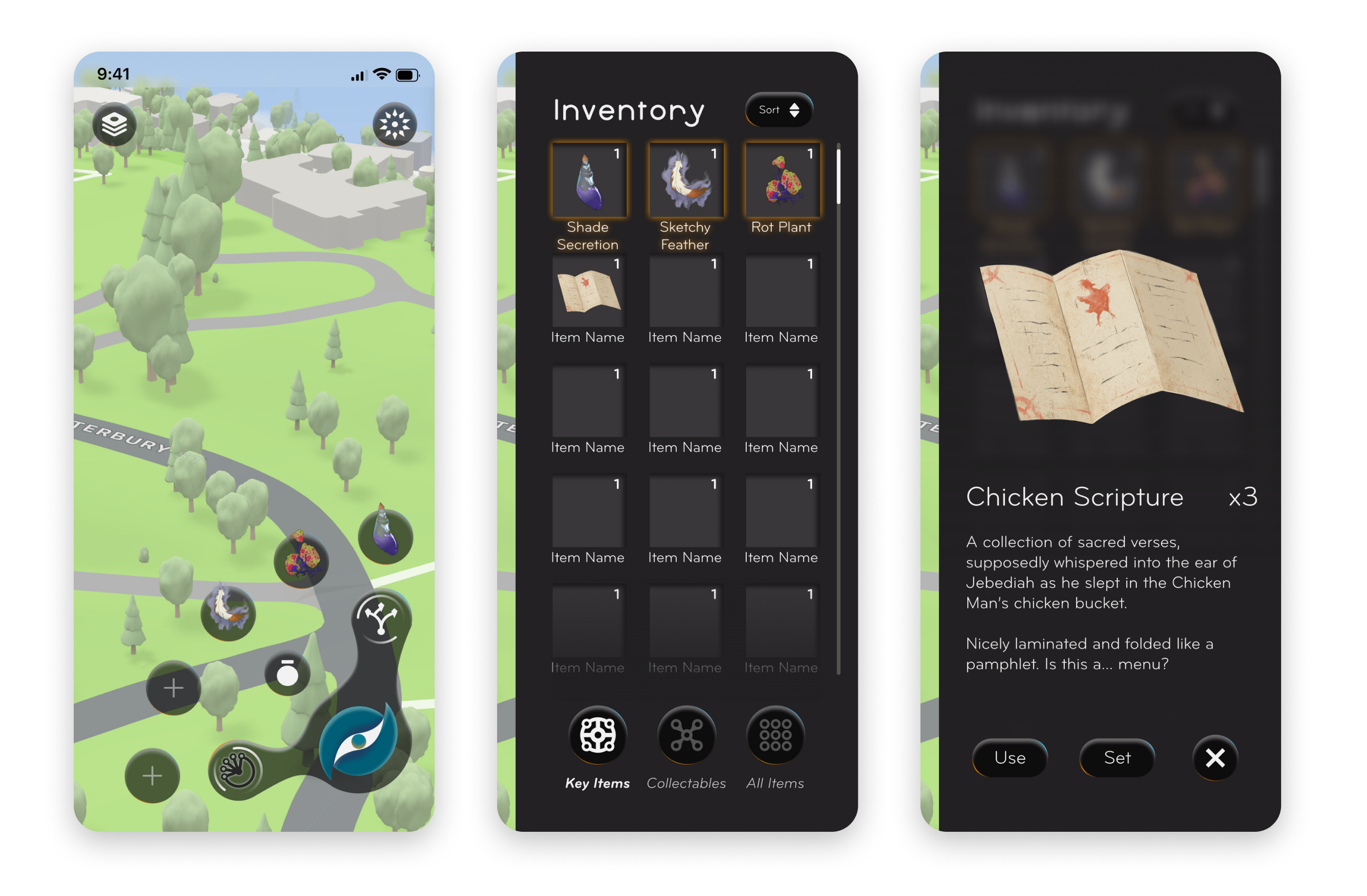
Feature #3: Quick Access for Inventory
Quickly access your inventory by storing up to five items in the slots. To view other items, just click the middle pouch icon. There is a sort feature, and you can read more about it, use it, or set an item into your quick access slots if you click on it.
Challenges
Creating a Design System
It was a challenge to work in a team in which everyone's design style is different. The way the client had split the work out initially was an attempt to be more efficient, but ultimately led to inconsistency in our designs.
It wasn't until we decided to work on the screens together in design sprints, confirmed designs with the client, and created a design system that we had more cohesion as a team.
Fulfilling Client's Vision
The client had a very specific vision in mind, but one that was also unclear at the same time. He had an idea but did not have descriptions that were easy to translate into tangible designs. Next time, it would be good to ask for more specific descriptors, such as "3-dimensional, textured, moody, modern, sleek, fantasy-like, etc."
Often, week by week, his requirements would change, and would approve certain things that were different from what he had proposed before. I learned to adapt to his critiques, and take feedback in order to continuously iterate until there was something he approved of.
We did a lot of research on existing games — not only mobile ones, but games in general, as well as making many mood boards to show our client. There was a lot of trial and error until we struck something the client subjectively liked.
takeaways
- Developing a design system, user flow, and site map early makes everything else efficient and cohesive.
- Adapt to feedback and continue to iterate. Stay determined and don't be afraid to ask questions to glean more on client wants/needs.
- Cohesion, Consistency and Communication — it is important to talk with my teammates and client continuously throughout the process. It's better to build together than build alone to accomplish consistency throughout our designs.
- Use research to back up design decisions — but know that sometimes it comes down to subjectivity of what the client wants.
- Client wants vs. User needs — sometimes the client's wants and needs would conflict with user needs. I had to learn to compromise my designs with the client's wishes in order to move forward.